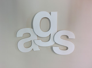
Kerning is to add or remove space between pairs of glyphs.
 Monospace typeface is one in which you can't adjust the kerning as the letters have fixed widths. Examples of these typefaces include Courier, Courier New, Lucida Console, Monaco, and Consolas.
Common problematic glyphs when it comes to kerning include V, W & Y because they expand outwards.
There are three types of kerning optical, metric and manual.
Metric kerning uses kern pairs which are included with most fonts. Kern pairs contain info about the spacing of specific pairs of letters e.g. LA, P., To, Ta, Tr, Te, Ty and Wa.
Optical kerning adjusts the spacing between adjacent characters based on their shapes.
Manual kerning is the most accurate method of the three as well as being the most bespoke way as it uses your own eye to manage to kerning.
Kerndown
Shortly after the kerning lecture we had been told to work within groups to come up with three different names for companies in an entirely different context, using only the letters we had been given. We had been given A, a, m, g & s.
The first one we came up with was Am, this would be a breakfast shop and the word Am seemed appropriate as a name given you would normally have your breakfast within that time period.
The third and final company was a high end clothing brand, called m A. We figured the spacing of the letters in itself which create a logo of sorts and with the letters being the initials of the original cloth brand founder.
The second task was a quick fire round where we had to create a word, again using our letters, to create a word to represent a company given by the tutors. We had 30 seconds for each word.
 |
| Pest Control Company |
 |
| Condom Company |
 |
| Student Nightclub |
 |
| Luxury Car Company |
 |
| Kids Program |
 |
| Quentin Tarantino Movie |


No comments:
Post a Comment