Friday 25 March 2016

OUGD406: Studio Brief 03 - Exhibition Branding (Group Contract)


Considering that the easter holidays are right in the centre of the whole time we have for this brief, we had to write up a group contract to ensure that everyone has an equal part in contributing to the exhibition design & production. This would then mean that, although we'd be able to keep each other up to date with on going designs and such whilst away from studio, when we return from the holidays we can quite easily put together the content we have between us and create a presentation to pitch.

OUGD406: Studio Brief 03 - Exhibition Branding (60's Inspired Moodboard Idea)


After researching further into the history of the building itself the idea of doing a 60's inspired theme of the exhibition would tie in with when the building came about. It was also mentioned that this style with the combination bright colours and shapes would contrast nicely with the brutalist architecture of the Bank House building.

Monday 21 March 2016

OUGD406: Studio Brief 02 - Licence to Print Money (Change of Direction)

Up until now I've been set around this idea of designing and creating a functional banknote, one that incorporates several security features. But after having a feedback session a point that was made was to focus more on creating a more ambitious piece, something that would be more attractive within an exhibition. Especially considering that it is an exhibition piece, being more extravagant with my ideas would more for a much more interesting visual as opposed to going for a more conventional and functional piece.

Given that one of my ideas was to have layers of acetate all with different parts of the design on to be then put together to create the full design, I thought of how I should display this.

I had two ideas, one was to create the layers and glue them together, or to maybe have it as a 3D piece and instead display the layers separately with space in between them so that the design is only visible fully from front on.


A 3D exhibition piece would make for a much more interactive experience rather than a flat 2D piece on the wall. This would be done by having some form of tight string/plastic fitted between each sheet of acetate to hold it together to make it 3D, almost like an exploded drawing.


One idea that was suggested from the feedback session was to do a CMYK colour split, so to have one sheet of acetate each corresponding with the four colours and so when placed together would create a full colour design. This as a 3D piece would create an interesting visual from all angles due to the design and colour combinations would appear differently dependant on what angle you viewed it from.


With the design, I thought that by sectioning off the denomination on the note into 4 parts and so when its viewed from front on, only then can you make out what value the note is.

An example of the idea I have is below, although this is glass and not acetate, it makes for the same effect.


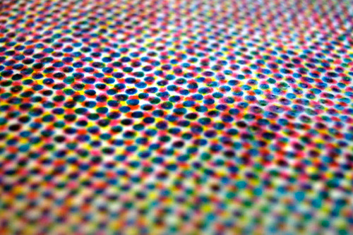
Given that this idea revolves around the CMYK colour split, a way in which this could be printed is through half toning. This method allows for less than full saturation of the primary colours, which is done through varying densities of the printed coloured dots. Although this method is usually used for printing photographs, it could also be used to create a unique look by instead using it to print a vectored design on the separate sheets of acetate.


Another idea I had for the style in which the note could be done was to go down this route of music. Whilst looking into security features of notes, I couldn't help but notice that the intaglio printing that is incorporated into bank notes looks very much like the grooves of a vinyl, which is where this idea sparked from.


Especially considering music is something that's universal, aside from people having their own preference of it, for the most part it's something that everyone can appreciate regardless of the genre.


The first two initial thoughts I had were to divide the denomination into 4 sections, one of two ways. One way would have the different vinyl grooves overlaid to create a colourful number or the second way was to have different sections one full colour so the denomination was only visible when all 4 acetate sheets came together.

Following on from this idea of splitting up the design onto sheets of acetate, it sparked the idea to create a anaglyph 3D piece. Given that this consists of the original image, one cyan and one red overlay to create a 3D look when 3D glasses are used.


The way in this would be displayed is very similar to the CMYK colour split one, in the sense that there would be several layers of acetate, but in this case it would be split into the cyan and red layered designs so when viewed from front on with 3D glasses, the banknote would appear 3D.

Saturday 19 March 2016

OUGD406: Studio Brief 02 - Licence to Print Money (Ideas & Inspiration)

A lot of current money designs are very complex, with lots of overlaid colours, textures and images, generally an important person or landmark or sometimes both.


The complex nature of the banknotes makes it harder to reproduce them and is in a way a security feature in itself. They tend to have a lot of textures within the design and this makes for a visually appealing look rather than using more conventional block coloured type and contrasting background.

A mixture of textures and potentially typefaces is something I want to include within my design to retain some of the complexity of current designs to ensure it couldn't be easily counterfeited.

Inspiration


Colours used in the wine advertisements above are soft and in a way neutral, they aren't too dark and dismal but also not too bright and overpowering, which potential use for a bank note seems like an appropriate idea.


Josef Müller-Brockmann Piece

Following on from the swiss designed advertisements from Studio JQ, I had a further look into swiss design as a whole. Reason being is that swiss design something that interests me personally due to it's use of shapes and colour combinations to create a clean and modern appearance.

This specific piece above, along with intaglio printing reminds me a lot of music and vinyl records more specifically.

Vinyl Grooves Up Close

This in turn sparked off an idea to create the design of my bank notes based around music, but more specifically the vinyl groove texture up close as shown above.


Seeing the Instagram post above from the creative studio twotimeselliott instantly gave me an idea to potentially incorporate some type into the bank note but as a design feature rather than a functional feature.

Possibly something similar to this below. Having the useful and correct information in bold to contrast with the slang terms for money in a lighter colour, could maybe make for an interesting visual along side other textures & type.


Thursday 17 March 2016

OUGD406: Studio Brief 03 - Exhibition Branding (Initial Ideas/Thoughts)

When we first got together as a group we instantly started to come up with concepts for the exhibition, considering all aspects of the room and how we could go about using these, whether that be projecting videos onto the wall space and creating dividers to split up the room given how big the open space is.

Initial Spider Diagrams


Some of our initial ideas involved having office furniture within the space to not only break up the space but also to show how we'd be incorporating the fact that the building is used for office spaces already rather than trying to overhaul the room completely with a different theme.

Another main idea we had was to have a running theme of security to do with money, so for example having a bank vault theme with the whole room being essentially a bank vault and the individually designed bank notes being contained within the room the same as money would be within a vault.

One other thing we considered and was set on including regardless of what theme we ended up going with was to have a feedback wall of some sort so that people could leave feedback on what was good or maybe bad about the whole exhibition. One of the stronger ideas for feedback was to have a UV feedback wall as this would link back to the UV security feature implemented within bank notes to confirm their validity.

Straight away our group created Facebook group so that we could keep our discussions of ideas on going regardless of whether we'd be within the studio or not.

Thursday 10 March 2016

OUGD404: Studio Brief 1 - How do you Read? (Full Booklet & Photoshoot)

On the reverse side of the booklet is a simple poster design that takes aspects of the colour theory booklet to make something that could potentially be displayed on a wall after reading, giving it a further use after already having been used for giving an overview of colour theory.

Poster Side of Booklet

Informational Side of Booklet


Thursday 3 March 2016

OUGD406: Studio Brief 02 - Licence to Print Money (Research & Initial Thoughts)

Brief

In an age of Apple Pay, Bitcoin, contactless, Paypal and other options for the transferring of funds, is there a future for "real" money?

Undertake research into the development of coinage and banknotes while also exploring the cultural understandings of legal tender. 

Following this initial engagement, begin a more developed interrogation of financial transactions in order to complete your own proposal for the future of the banknote.

Research & Initial Thoughts

Money is seen as any 'clearly identifiable object of value that is accepted as payment for goods and services'. 

For the most part each country has their own currency, some share the same currency e.g. the euro. There are ways to exchange a certain amount of one currency for another to use within another country, known as 'exchange rates'.

But this hasn't always been the case, before money, goods were generally exchange for other goods. Those goods being anything from cattle to wheat to expensive beads were used as currency before money came about.

Given how the world revolves around money it needs to be something universal and most definitely needs to be versatile enough to allow for use by anyone even those visually impaired, so incorporating something such as braille is a must.


Example of braille on a banknote
One thing I started off by doing was asking friends and family what they would currently change or do differently about the current bank note.


Plastic Bank Notes
Polymer

Most currency notes at this moment in time are paper bank notes, but slowly over the years more and more countries are transitioning over to polymer notes simply because of how much of an advantage they have over paper bank notes.

Waterproofing is a current problem with paper bank notes, accidentally putting money through the washing machine or spilling something onto it etc. are all everyday problems with having paper notes. But using polymer for bank notes that are coated in varnish protect from this problem occurring.

Process of Polymer Bank Notes:


Aside from the obvious con of the transition, that being cost, ultimately it would benefit the economy long term through not having to replace the notes as often from ripping, tearing etc. since polymer is a much more durable material.

Another benefit of polymer banknotes include them being harder to counterfeit, especially considering in 2012 over 700,000 counterfeits were removed from circulation which show it's an obvious problem with current bank notes.

Security Features are another advantage that polymer bank notes have over current paper notes. Examples of these features include intaglio printing, offset and letterpress printing, latent images, micro-printing and intricate background patterns. 

Some of these examples are things that I will be able to incorporate into my bank note such as letterpress and intaglio printing, but other more complex features such as micro-printing won't be feasible due to it's complexity.

One potential security feature that I think is feasible and could potentially be included is a clear screen print of either a symbol or type. But this wouldn't be visible upon first glance but only when looked at from certain angles.

I will aim to incorporate at least one or possibly even several of these security features to ensure my bank note is something realistic and functional as opposed to purely aesthetic based.


Example of Micro-Printing
Example of Intaglio Printing

Example of Letterpress Printing
Another problem with the current bank notes, is the ability to differentiate between notes within dark lighting. Although this doesn't seem like such a problematic thing, I think it's something that should definitely be solved given how money is such an integral part of everything we do and so it should be made to withstand any given environment.

Potentially adding something such as a reflective number onto the bank note so that it will be easier to differentiate between them in dark environments.

Example of Reflective Lettering

Wednesday 2 March 2016

OUGD406: Studio Brief 01 - Secret 7 (Evaluation)

Secret 7 was something entirely new for me, in respects to both the design aspect of this but also the fact that it was a live brief, something I’ve never taken part in before. Competing against others always makes the brief more interesting as it means you have to go the extra mile to ensure your designs stand out and are unique.

Considering that this brief was to design several different vinyl covers, it was mostly aesthetic based design as opposed to any other brief we’ve done up to this point where it’s usually informed by thorough research and design process. Although within some of my designs there was underlying concepts related to the song, they were only really relevant to a song lyric or the theme of the song, no substantial concept.

Originally I set out to create something that was visually appealing and that stands out from other designs and I think I achieved this through the design on the left. The psychedelic nature of it makes for an interesting visual, due to the mixture of bright colours but also the composition itself.


I think if I was to enter Secret 7 again or a similar competition, I would work more on my idea generation rather than picking ideas straight away that I thought would work best and going through with them as this prevents any further, potentially better ideas, being produced.