Given that one of my ideas was to have layers of acetate all with different parts of the design on to be then put together to create the full design, I thought of how I should display this.
I had two ideas, one was to create the layers and glue them together, or to maybe have it as a 3D piece and instead display the layers separately with space in between them so that the design is only visible fully from front on.
A 3D exhibition piece would make for a much more interactive experience rather than a flat 2D piece on the wall. This would be done by having some form of tight string/plastic fitted between each sheet of acetate to hold it together to make it 3D, almost like an exploded drawing.
One idea that was suggested from the feedback session was to do a CMYK colour split, so to have one sheet of acetate each corresponding with the four colours and so when placed together would create a full colour design. This as a 3D piece would create an interesting visual from all angles due to the design and colour combinations would appear differently dependant on what angle you viewed it from.
With the design, I thought that by sectioning off the denomination on the note into 4 parts and so when its viewed from front on, only then can you make out what value the note is.
An example of the idea I have is below, although this is glass and not acetate, it makes for the same effect.
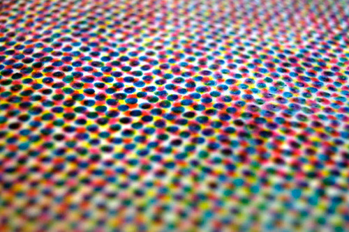
Given that this idea revolves around the CMYK colour split, a way in which this could be printed is through half toning. This method allows for less than full saturation of the primary colours, which is done through varying densities of the printed coloured dots. Although this method is usually used for printing photographs, it could also be used to create a unique look by instead using it to print a vectored design on the separate sheets of acetate.
Another idea I had for the style in which the note could be done was to go down this route of music. Whilst looking into security features of notes, I couldn't help but notice that the intaglio printing that is incorporated into bank notes looks very much like the grooves of a vinyl, which is where this idea sparked from.
Especially considering music is something that's universal, aside from people having their own preference of it, for the most part it's something that everyone can appreciate regardless of the genre.
The first two initial thoughts I had were to divide the denomination into 4 sections, one of two ways. One way would have the different vinyl grooves overlaid to create a colourful number or the second way was to have different sections one full colour so the denomination was only visible when all 4 acetate sheets came together.
Following on from this idea of splitting up the design onto sheets of acetate, it sparked the idea to create a anaglyph 3D piece. Given that this consists of the original image, one cyan and one red overlay to create a 3D look when 3D glasses are used.
The way in this would be displayed is very similar to the CMYK colour split one, in the sense that there would be several layers of acetate, but in this case it would be split into the cyan and red layered designs so when viewed from front on with 3D glasses, the banknote would appear 3D.


No comments:
Post a Comment