I further developed some vector mockups in illustrator to make sure that the user interface was clear and easy to understand before mocking it up in an actual environment.
Firstly I assed what needed to be included within the interactive display and also the overhead signage, since my very first mockups were quite basic and didn't tell the user an awful lot about their route.

Overhead Signage


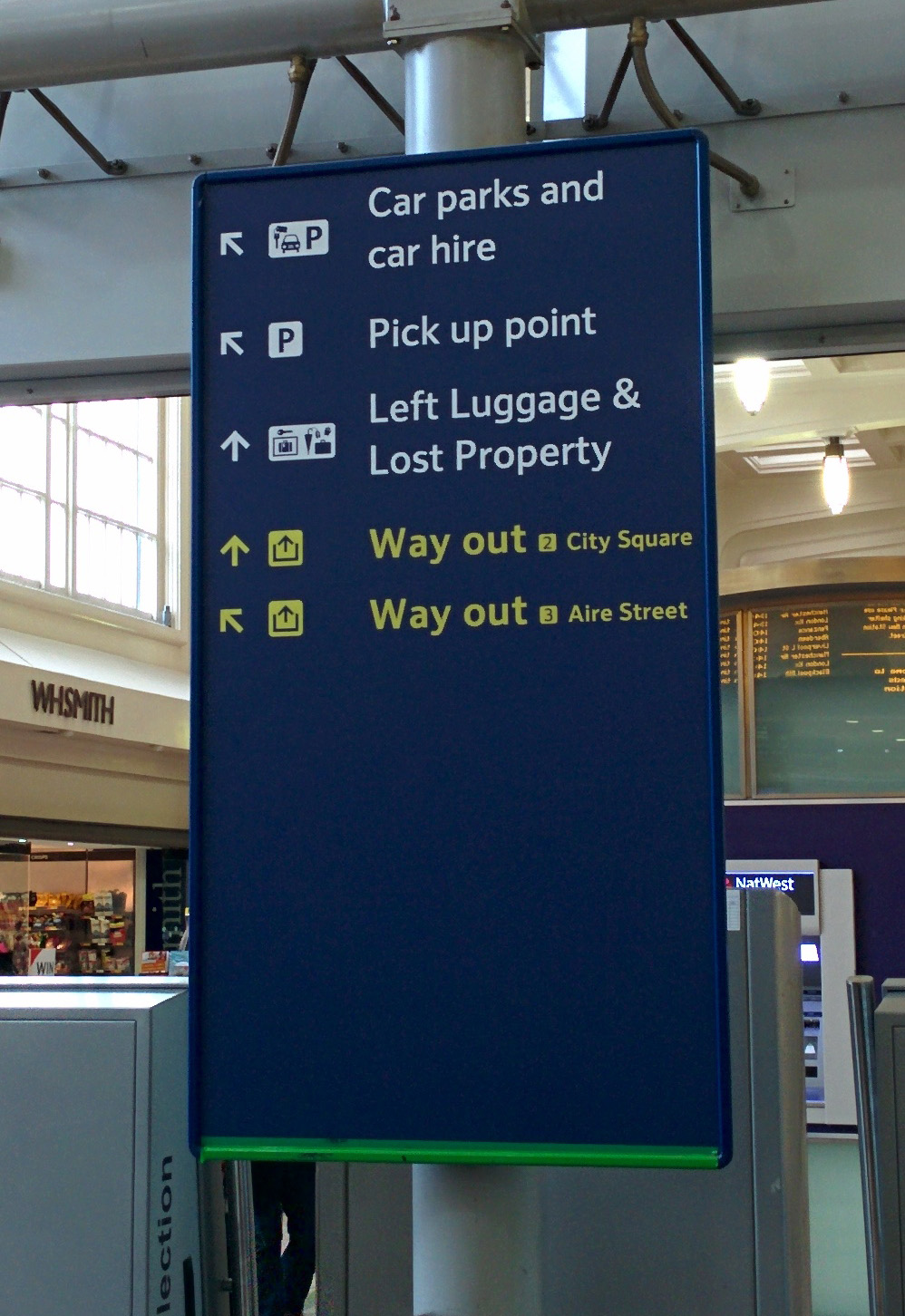
The National Rail's way finding guideline PDF came in use several times throughout the creation of my overhead signage. This was one of those times as the arrangement and order of places and shop names and their corresponding directional arrows play a big part in allowing the user to understand where they need to go at a glance, because as shown in the example above, if arranged badly could mean the user has to take longer than usual to consider their next move.
Information hierarchy and the positioning of 'way out' information was something else I considered.

Taking all of this into consideration, I altered my previous overhead signage mockup and created something much more clean and easy to read.

One thing that I included in this mockup, but not within my previous ones, is popular shop names. Reason behind this is that on the current signage there is empty space that could be put to better use and I felt that directions to big name shops would be useful information to include within the signs given how frequently they're visited by people.
The colours of the signage were equally as important as the information on there. I chose colours that correspond with the floor as this makes it easy for people to establish which floor they're on without having to find the next nearest sign to do so.
As for the typeface I used Helvetica simply because of it's large x-heights and rounded letterforms which makes it clearly legible from a distance, which is key for overhead signage as it would be useless to have a typeface that means you can only read the sign if stood within very close proximity. It also has a consistent and uniform feel to it, which not only makes it economical with space, but also means it’s easy on the eye.

Stand Alone Signage

Given I wanted my signage to be universal so that people of all languages could understand the flooring system, I scrapped the original First Floor, Ground Floor and Lower Ground Floor which was originally in place and instead swapped it out to a numbered system. In doing so, would avoid any confusion as numbers are the same universally.
A few things that I thought were problematic about the current signage, is that it was quite hard to read from a distance and although the colours contrasted well enough for the text to be legible, the size and spacing of the text meant it was only readable from quite close up.
To improve this, I increased the leading and made the sign the full width of the stand as I felt the wasted space around it simply to have fancy backlighting was not at all necessary and didn't contribute to the readability of the signage.
 |
| Final Mockup |
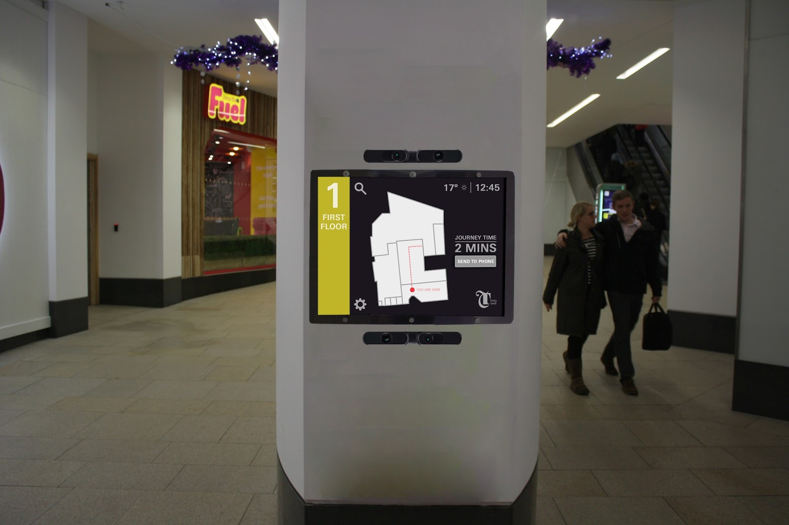
Interactive Display
The idea is that when the display is not in use, it would display useful information such as current offers in shops etc. or potentially any customer notices, like earlier closing times. But when the sensors detect someone approaching the screen it would change and greet them with a language screen.


Then the map of the current floor and all the shops on that floor would be shown and allows for the user to select one or multiple shops that they want to visit and the display would calculate the quickest route to the shop(s) and give them an estimate journey time as shown in the example above. The display would also show other bits of useful, standard information such as the time and weather but also gives the user the ability to send their route to their phone in one quick, simple touch using NFC.
 |
| Route displayed on Phone |
Final Mockups