The material they use for their signs is a mixture of glass and a glossy plastic and with both of those sometimes comes glare and reflections which can obstruct people viewing the signage, ideally what I want to have instead to use regular matt signs much like those that are used within National Rail train stations as they are far more clear, regardless of what angle you are viewing them from.
Another thing I thought that could be changed with Trinity's current signage is that they tend to have all one colour signs. Although this is helpful for indicating which floor you're on by having corresponding coloured signs, it can reduce legibility and I often found myself spending more time having reading the signs, rather than it being a quick glance as I'm passing by.


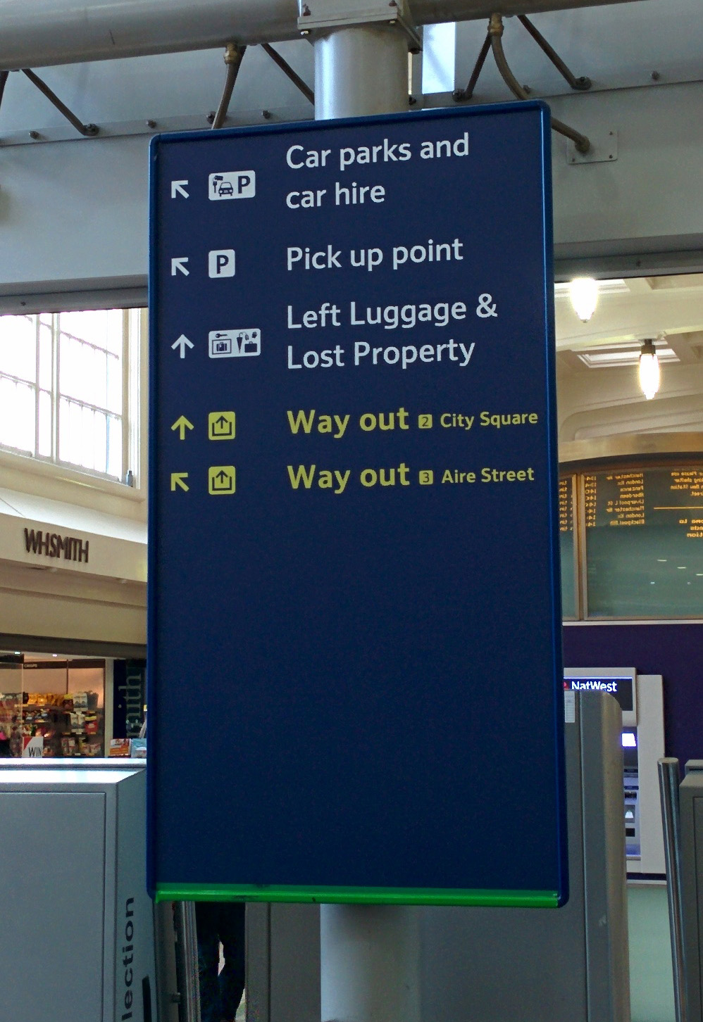
Above is an example of signage that, design wise, I wanted to for not only for it's legibility but also it's aesthetics.
 |
| Initial Ideas for Signage |
As for the shape of the signs, I wanted something relatively simple and bold, typically you would associate squares or rectangles as the most appropriate sign shape since it allows for text to span the whole width of the sign without being obstructed by any curves or anything of the sort.
Currently Trinity use a rectangle with two of the corners rounded off to replicate part of their logo.

This shape differs from standard way finding signs and so given it's uniqueness and meaning behind it, I will aim to stick to this shape or at the least, a variant of it.
 |
| Sketches |
 |
| Initial Idea |
The black type and white background creates a very clear contrast, allowing passers by to read the text quickly without having to stop and stare at the signage. Increasing the font weight of the text means that it also contrasts more, increasing it's overall legibility from a distance.
Developing pictograms for a place such as Trinity is a task in itself, simply because of how legible they need to be so that they're universal so that everyone can understand them. Although this should be a given for pictograms anyway, sometimes within creative areas such as design studios, art colleges etc. you could possibly experiment with more arty pictograms to fit with the environment.
For trinity I wanted bold, high contrasting signs pictograms to ensure full visibility from any angle and within a reasonable distance. Having the signs possibly backlit, such as within the example below, would increase the contrast even further whilst also looking aesthetically pleasing.


As much as I wanted to improve their wayfinding, I didn't want to have a complete overhaul of the current signage system as I think some aspects of it work adequately already, hence why in the example above I tested out the numbering system on what is their already existing signage. The first example is very similar to their current system, but incorporating this numbering system to match with their worded alternative meant it would be universal, allowing anyone of any language to understand which floor is which. The middle example would be the most appropriate example, simply because within the third example, the colours don't contrast as well and from a distance could be illegible.

After putting more thought into this, I figured large, bold numbers, possibly with colour coded floors, would serve better visually as it would be legible from a distance in comparison to their current design.

The arrows used on the signage are always important, as they need to be equally as legible as the words on them. Typically the examples on the left hand side are most common, but one thought I had would be to possibly have digital signs that could alter information when needed, hence the other dotted examples, as these would be made up of small dots to create the arrows and also the words on the signs.
The idea of having digital signs would mean information could be changed at a moments notice, making the signs much more versatile, for example if there was a fire, they could display directions to the nearest fire exit etc.
No comments:
Post a Comment