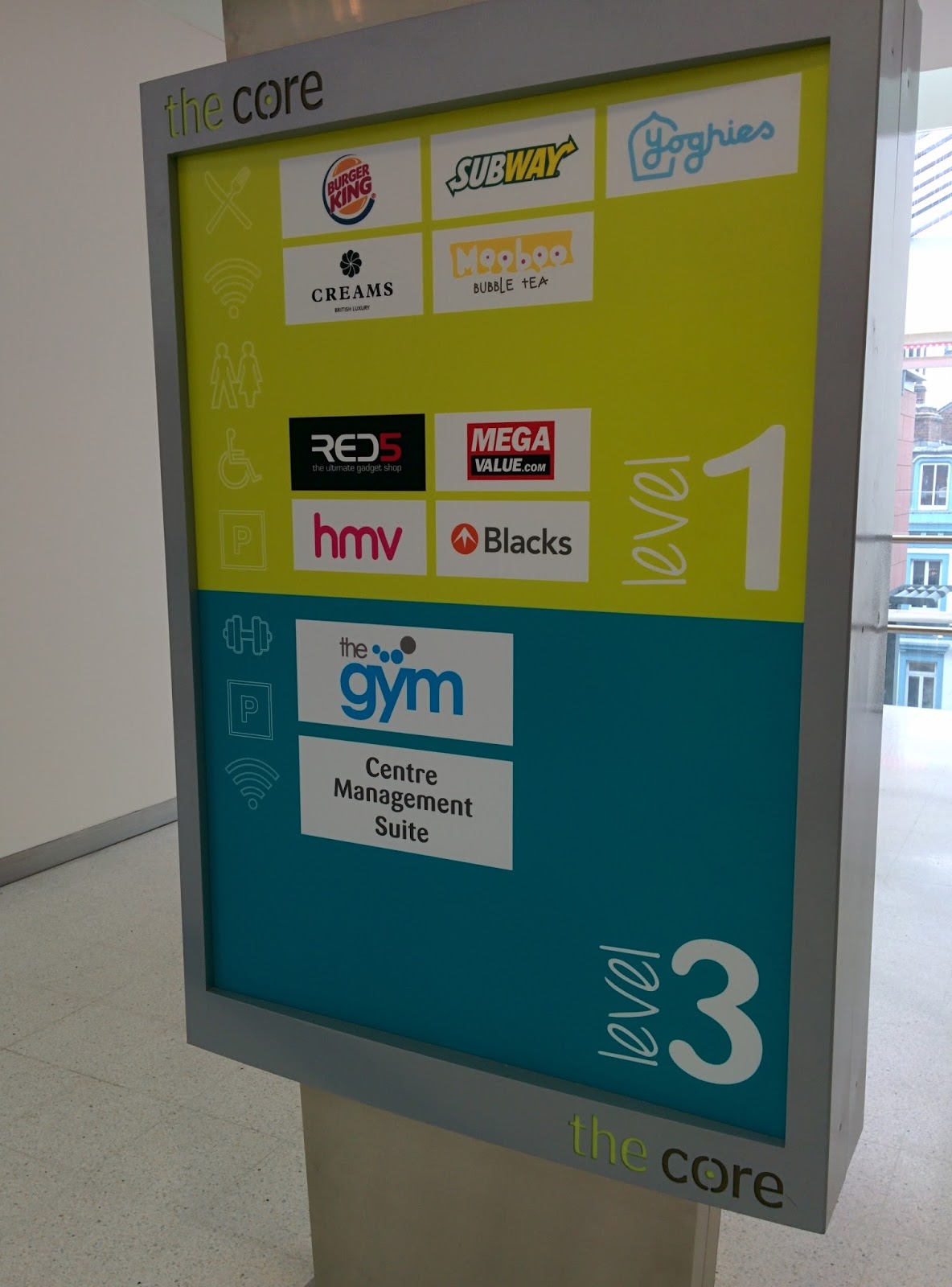
Initial thoughts were to visit a range of places, both art galleries and shopping centres such as the Trinity and also Leeds Art Gallery to get a feel for how their current way finding signage is. Taking into account things such as the clarity of each sign and how useful they are in terms of pointing me in the right direction. As a whole, they were adequate enough for their purpose but I felt Trinity could do with some improvements. Reason being that there didn't seem to be enough signage around the centre and even when there was it wasn't 100% clear which direction I was supposed to be going in.


Getting to grips with the basics of way finding and understanding what elements are considered vital, was the first thing I wanted to do. Although some aspects such as colour contrast and scale seem obvious components, I wanted to ensure I considered every possible option when it comes to way finding signage to ensure it's the most useful and legible signage.
A way of thinking about how signage should be is to not having to make the person reading it think too much, instead unnecessary info should be disregarded leaving only information possibly accompanied by pictograms left on the signs to ensure the person's journey flows as smoothly as possible.
The National Rail Signage Guidelines PDF was a very useful source as it identifies each aspect of their current way finding signage and goes in depth as to why they chose what they did. Given how successful their current signage is, I felt this would be an accurate source to take information from.

Even the height of the signs is important, the National Rail Guide suggests a height of around 3.5m for the signage, this is not too high that people reading it would have to stop and stare directly upwards but also not too low to come in collision with anything or anyone.
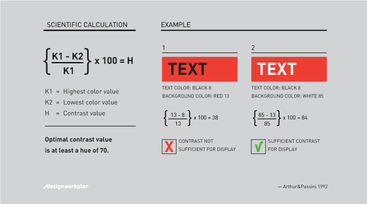
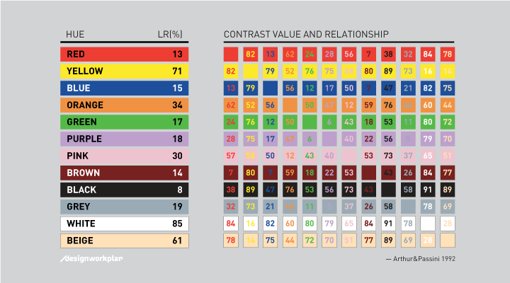
Colour is a very important part of any signage as if there is not enough of a contrast between colours, the text will be barely visible and although it may look visually appealing, it would be practically useless as at a glance people will struggle to read the signs.
Above is a table of colours, all with corresponding values out of 100 that ultimately rate how legible one colour is when placed on top of another colour. With it, is the calculation as to how each of those values shown were obtained, with a simple mathematical equation. This is will come in handy when it comes down to choosing colours for the signage because although, to me, it may seem legible and aesthetically pleasing, it may not be the same for everyone.
The typeface used realistically would be a sans serif typeface as they're more often than not a clean and legible typeface as serif fonts can sometimes be somewhat complex in terms of each letterform. Suggested sizes from the guide are as follows:
7 Metres = 160 Pt Size
9 Metres = 190 Pt Size
14 Metres = 320 Pt Size
18 Metres = 380 Pt Size

Although the colours and typeface choice may be perfect on signage as far as legibility goes, from a distance they may not even be clear enough to see if an appropriate point size isn't used.
Suggested key aspects that need to be considered when choosing a typeface include good legibility with large x-heights, wide letter proportions and prominent ascenders and descenders.
I found a few typefaces that closely fit to these 'requirements':
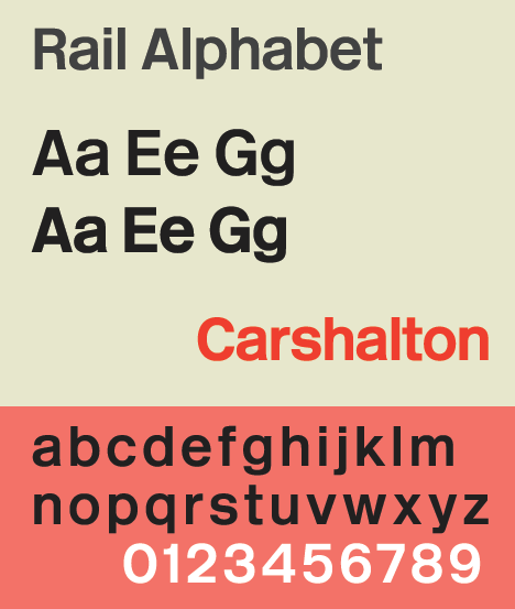 |
| Rail Alphabet |
 |
| Geneva |
| Clearview |
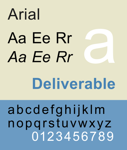 |
| Arial |
And of course, how could I forget..
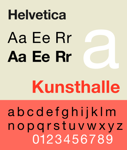 |
| Helvetica |