Trinity


Leeds Train Station


Leeds train station on the whole had a lot of signs about indication everything you could possibly need to find. They all retained the same colour theme throughout which made it easy to identify the station's signage from shop signage. The signs were completely legible given how the white type contrasts very well with the dark blue colour of the signage, along with that they used a clean sans serif typeface for the signs. In some way the arrows aren't completely clear in which direction they're pointing, for example the diagonal arrows could possibly confuse some people, especially considering the many different shops and passageways within the station.
The Core


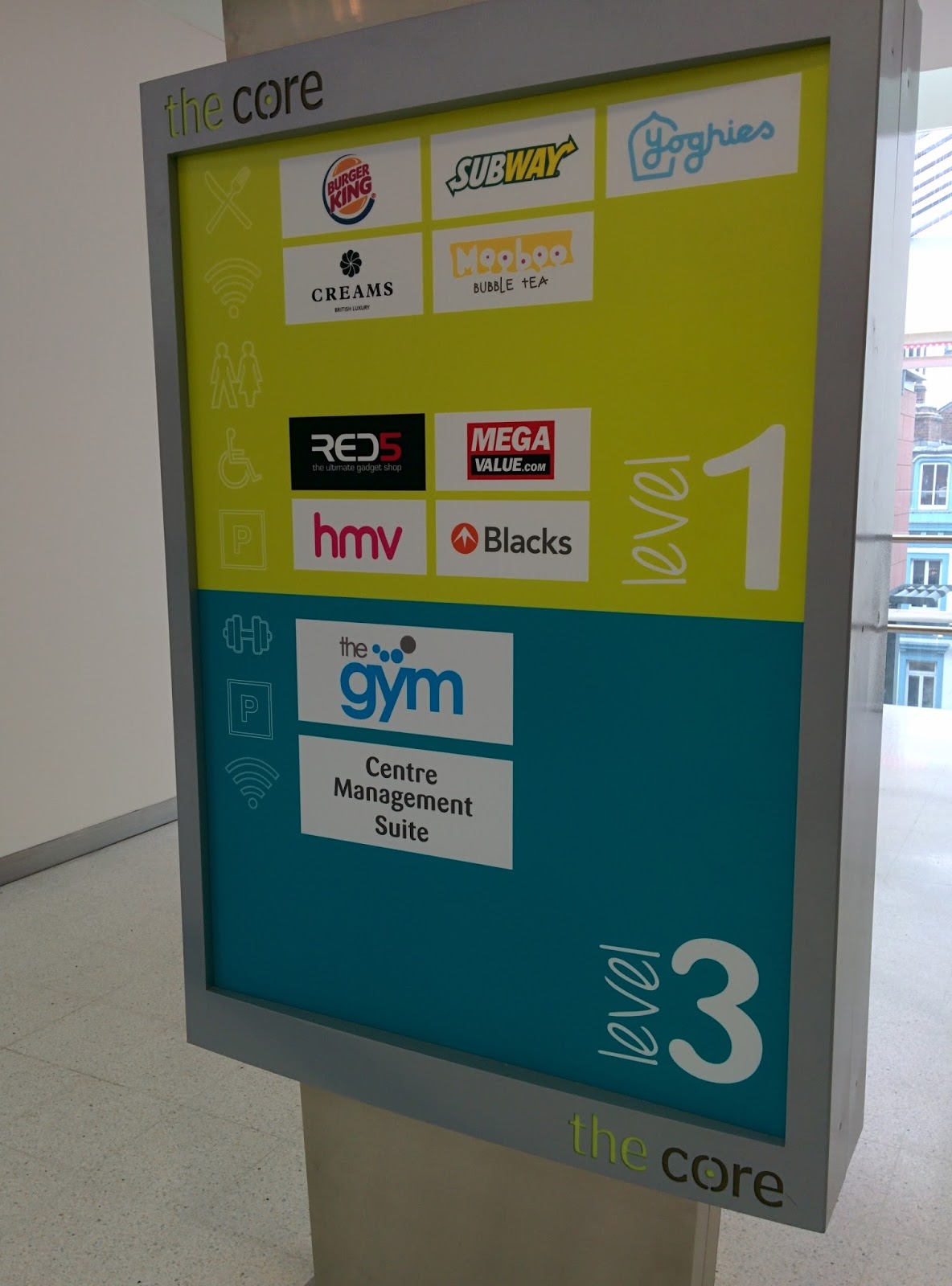


Although the signage within the core building may appear colourful and attractive, for the most part it is barely legible even up close as some of the pictures demonstrate. This is because of the fact that they've used such a thin typeface contrasted with bright colours such as lime green. Not only that but the signage itself isn't all that clear and gives no indication of where the shops are aside from stating which floor they're on. The typeface used is playful and fits in with the colour scheme used but from a distance may not be entirely legible due to the handwritten style of it compared to a regular sans serif font that was used within Leeds Train Station and Trinity. The size of the signage was adequate especially considering it stood prominent at the forefront of the building entrance, meaning people wouldn't have to spend time searching round to find directions to shops. I feel as though if the signs had been backlit this would have helped with being able to read the type as the signage was quite dull and not really all that appealing.
No comments:
Post a Comment