From the final feedback session we had for this brief, I received lots of feedback about my finished typeface but most importantly a large portion of the feedback was critical points about how I could potentially improve my typeface.
“...however the structure and form also appear quite aggressive, erratic and dangerous due to the broken, fractured appearance”
This is one concern that I had about this chosen typeface, as the way it appears to be fractured may imply a totally different adjective. But I think if I was to have another attempt at this typeface, I would have avoided too much of a fractured appearance and instead focused more on the shaky and fidgety aspect of the letterforms to get across this feeling of nervous much more obviously.
“Certainly distinct, but due to the detailed typographic form it wouldn’t be very versatile”
When creating my typeface I had the hard decision of whether to make a typeface specifically as a display typeface or allow it to be versatile for any sort of use. But ultimately I went with a display typeface as I wanted to make a distinct and unique set of letters that would portray my adjective as opposed to making only minor adjustments to the original letterforms to retain it’s legibility and for it to be a versatile typeface.
“...not sure if it reflects the word because it’s too structured”
When looking back at my typeface design it does appear too structured almost as if I’ve tried too hard to stick within the confines of the original letterforms. This would not be the case with a nervous person, as they would most likely be a lot more jittery and inconsistent, which is one thing I would aim to recreate if I was to redo the typeface.
“Maybe experiment with making it look more ‘shaky’”
If I was to have another attempt at redesigning my typeface I would have experimented the composition of each letterform, making them more exaggerated in the hope of achieving a more nervous, skittish appearance. This could be done through using a mixture of effects within both Photoshop and Illustrator to displace certain parts of each letterform.
“Not legible enough for body copy, but would make a good type for display purposes”
As stated in a previous point, my typeface isn’t all that versatile and realistically would be used as a display typeface due to it’s obscure and somewhat illegible nature. One thing I could have potentially considered doing is making a typeface that would work as both body copy and a display font, one that retain the shakiness of the current typeface but with less detailed individual letterforms so that it would work at any scale.
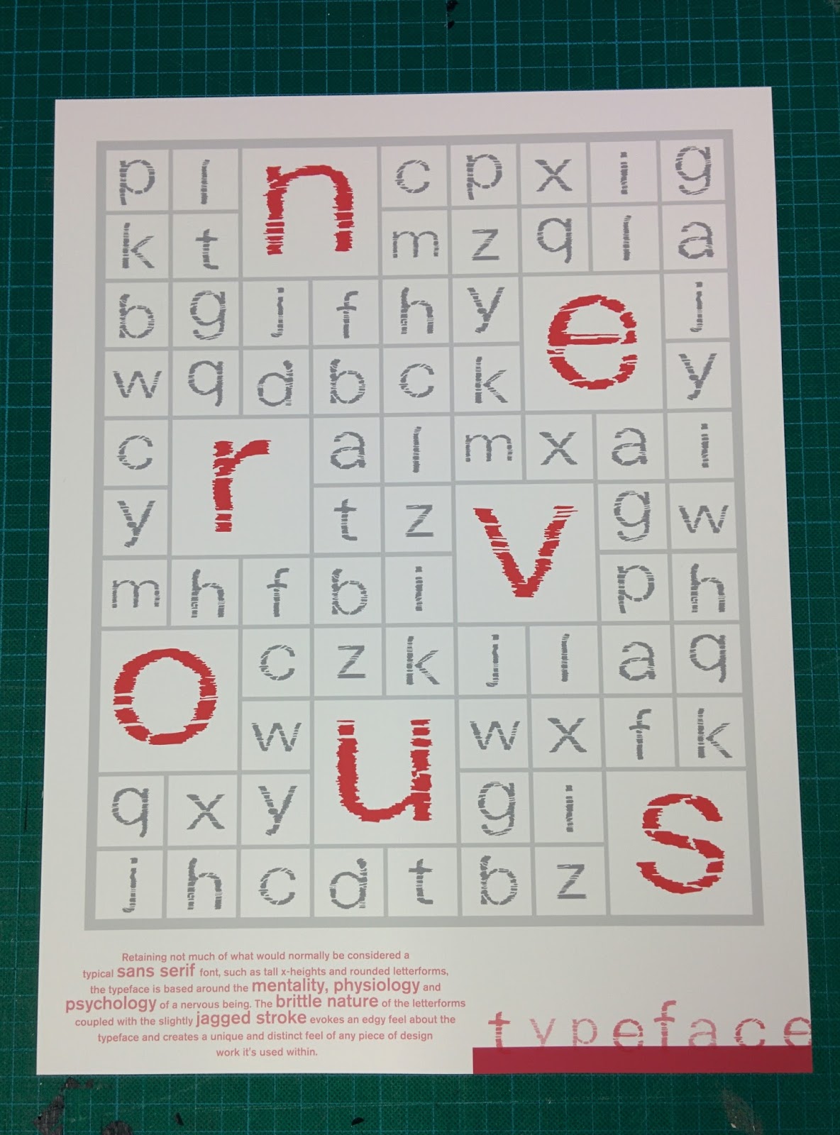
As a whole, I felt that my final resolution was successful in terms of achieving my aims and also what the brief had originally asked for. I believe that my typeface was bespoke and managed to capture several different aspects of my adjective ‘nervous’ including the mentality, physiology and psychology of a nervous person.
The formative feedback I received within the two interim critique sessions I felt played a big part in helping me narrow down my ideas and to further develop my strongest ideas. This in turn allowed me to improve and ultimately finalise my typeface design into something I felt was an appropriate response to the brief.
 |
| Final Resolution |
 |
| Final Resolution GIF |
 |
| Final Typeface Specimen |
No comments:
Post a Comment