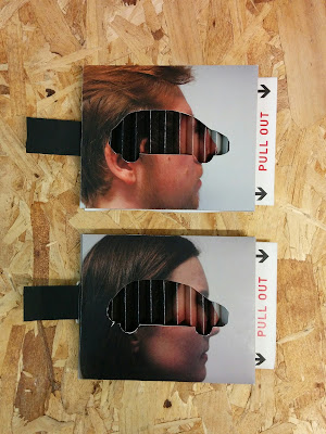
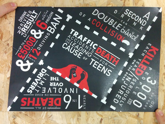
For my final feedback session for this brief I received several critical comments about my piece that hadn’t occurred to me during the process of making of it. I asked several questions in the hope to get critical and useful feedback points.
‘Is the style in which the piece is done appealing?’
‘Yes, but with the way the car crushes, it only crushes a small part of the face which to some may not give the full effect of the consequence of drink driving’
This was one thing I was worried it may end up looking like, although I was happy with how it looked in the end I think if I was to redo this piece I would have adjusted the size both the car and the face so that they lined up better meaning the majority if not all of the face fit within the car to get across the message better.
‘The creative typography layout is appealing, although this is essentially hidden so doesn’t draw in readers until they’ve committed to engage. The interactive elements make the initial impression of the leaflet appealing. The front images are quite static, maybe if they had a shocked expression it would bring more life and movement to the leaflet?’
The expressions of the people’s faces are something I didn’t at all pay much attention to when it came to taking the photographs given that my initial idea was to just have their face printed on the front. But I think the suggested idea of have a shocked or possibly upset expression would create more of an intriguing front cover for the envelope, which would be something I could do if I was to redo this brief.
‘Would this envelope/leaflet combination make you think twice about drink driving?’
‘Although the inside message is hard hitting, it may not affect some people given how broad of a statement it is. Not really personal’
I agree with this as, although the message is a harsh warning message, it isn’t all that personal to people in particular. Especially considering that after a few drinks a lot of
people feel ‘invincible’ hence why they think they can get away with drink driving and so they will also think that this message doesn’t apply to them.
Maybe something more personal something along the lines of linking it in with putting their family at risk both physically and emotionally would be more effective.
General Feedback
After talking amongst the people within my critique group and telling them of how I planned on distributing this leaflet, they mentioned that posting something as big and bulky as this through the post may be a problem as it may get crushed or broken during the process of delivering it. So a suggestion that was made was to post just the leaflet, with a slightly different front cover design, through people’s doors but keep the interactive envelope and leaflet combination to hand out in certain places such as colleges/ universities etc. since that’s a large portion of the age range I’m targeting with this campaign.
This is because of how there would be no problem with the physical piece being damaged during transportation and instead people can witness first hand the effects of drink driving through interacting with the leaflet.
Overall, given what my initial aims of this brief were, I think that I achieved them in creating a scaremongering yet informative leaflet, whilst keeping it interactive to retain people’s interest with the leaflet.
I feel that I was able to communicate the information in a clear yet understandable and engaging way, whilst keeping it to the my target audience, that being 17-29 year olds.
If I was to do this brief again, I would have several things that I would change in the hope to improve my leaflet and the concept behind it. One of those being the front cover layout, shrinking the size of the face to ensure that it fit within the size of the car would have made for a more shocking appearance. Also the point about distributing it through the post may not work as well as I initially anticipated as the end product was somewhat bulky compared to a standard leaflet or letter.


