 |
| Initial Sketches |
Following on from this idea of taking a slightly more unusual approach towards a drink driving campaign and creating an informative yet scaremongering one, I thought of a few ideas that involved a tab that would reveal something such as a body bag or a hearse. This coupled with the car shaped leaflet, I figured, would intrigue people more so than a typical, rectangular shaped infographic.
My whole aim for this infographic is to show people the potentially consequences of drink driving, because although most people know what can happen, I feel being shown what can happen will shock people into thinking twice about doing it.
Idea 1
My first initial idea consisted of a car shaped, infographic booklet that would have a tab to pull back the front page of the booklet, which would in turn crumple the car shape, immediately showing readers one potential consequence of drink driving before they even begin to read it. My thought behind this is that it would intrigue the reader as they would be interacting with this straight away as opposed to reading it briefly and losing interest and disregarding it.
 |
| Idea 1 Initial Sketches |
Given the fact that there are more drink driving accidents that involved people between the ages of 17 and 29, one thing that I thought about was that quite a lot of younger people tend to care a lot about their looks and by someway incorporating this fact into the leaflet, I thought would make for a harder hitting infographic.
The way I would do this is by having a picture of someones face to fit with the full size of the leaflet, so when the tab it pulled back to show the car being crushed, it would also show the face being crushed at the same time, creating a twice as dramatic opening to the leaflet. This would be opened to reveal facts on the inside, coupled with illustrations to match the facts to create a small 'scene' for each fact, rather than just the text on it's own.
For this, I decided that a thin paper for the front cover, something along the lines of
Inspiration


The style in which this typography is done is much more visually intriguing and allows for certain, more important, aspects of the piece of text to stand prominent and catch the readers eye. Creating a mix of different size and weight text will stray away from a regular shaped block of text, which could be deemed 'boring' or 'disinteresting', ultimately creating a more appealing appearance.

The first few initial sketches I did were to give me a rough idea of the facts put in an environment, coupled with a small relevant illustration to further assist the fact in somewhat scaring the reader into thinking twice about drink driving.
Idea 2
This idea was something that I felt would be less of a scaremongering way around informing people about drink driving and instead it would be something more relatable to the younger portion of drivers (aged 17-29) which is where the most drink driving accidents occur.
My idea stemmed from a set of train etiquette adverts from Queensland, which take a different approach to warning people about certain things you should and shouldn't do whilst on a train. A few examples are below:


Although my approach wouldn't be as comedic as this, the whole idea of these ads being more of a story to tell as opposed to the usual commanding instructions on ads warning people about the consequences of their actions, I feel is much more relatable, especially to the younger generation of drivers.
Folding Techniques
 |
| Initial Folding Ideas |
The way in which I wanted the leaflet to fold would have to be chosen based upon how interactive and easy on the eyes it is. By this I mean, having something such as a huge 8 folded leaflet would likely disinterest the reader since it would appear as too much to read all at once, whereas a smaller, roughly A4 sized complex fold out would grab the readers attention as it creates a middle ground of not too much info, but also not too little.

 |
| Chosen Folding Technique |
A few examples of folding techniques I considered are above, but the problem I had with some of them is that, as explained before, for the size of the leaflet, a lot of information would have to be displayed which could ultimately put off the user from reading it, and especially considering that my main target range is younger adults/teenagers, they would be quicker to dismiss something that they believe doesn't concern or is too much to read.
Although my chosen folding technique is similar to one of the others I considered, the way it folded meant that some areas overlap making it hard to have separate sections for separate statistics, like I envisioned in my initial sketches as shown below.

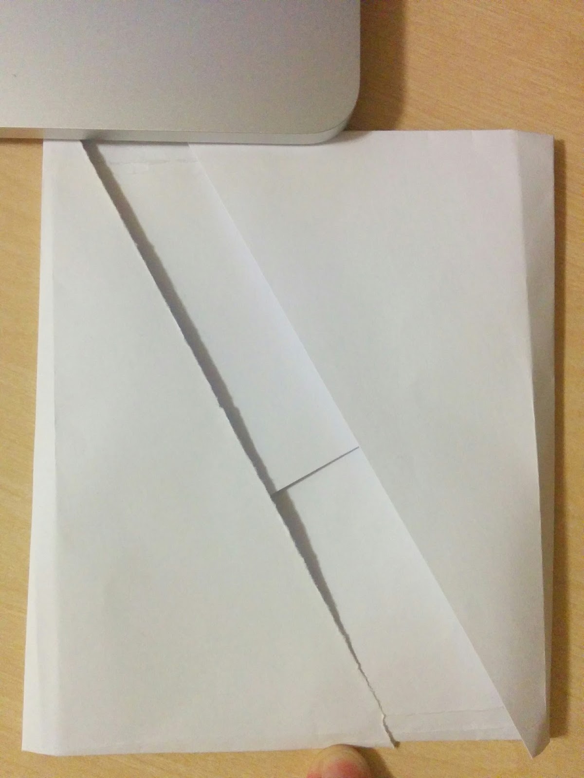
Below is an attempt I made at creating the inner pull-out leaflet that would be held within the pouch, shown how it opens and closes. The folds aren't 100% accurate, but my aim is to keep adjusting it until it folds correctly.


Another thing I had to consider for the front cover of the pouch was how the tab would function, so that when it was pulled back it would pull the paper with it to represent the car and also the drivers face being damaged, the same as what could potentially happen within a drunken car crash.


No comments:
Post a Comment