Saturday, 29 April 2017

Alternative Outcomes

One thought that crossed my mind was to use my design but to screenprint on a coloured stock instead of plain white, this way I was hoping it could create a much more bright and eye catching piece.

I originally only bought the 270gsm stock on the right from Fred Aldous to print on but found a another sharper pink lying around which I printed on also. Although the shade of pink is much brighter and deeper, it's not what I had in mind, personally I preferred the more pastel-y pink.


Unfortunately, even after double printing some of the prints and adding more ink to my medium, the white didn't contrast as much as I would have liked. It could have been much sharper, but instead was somewhat dull.

Even before I began to print my design onto the pink stock, I test printed on some tracing paper to ensure the ink came through properly. But in the process of doing so, I realised that my final poster could be displayed differently to what I had planned. It could potentially be two separate layers, the background heart and lines on the thick stock then the black text on tracing paper. I liked the idea of this because it gives it more depth and also a different appearance to other designs that will be within the exhibition.


A suggestion put forward when I was choosing between the two final posters, was to possibly combine both of them. Considering that they were to be displayed in four separate pieces, pieces of both posters could be mixed together to create a different look.


I do like the look of these, it further emphasises the fact that it represents people coming together as the different coloured stocks could be seen the different cultures, races and genders coming together to form this one piece.

Ultimately I submitted the white poster because in my opinion this one stood out to me and others the most. With the pink poster, it was really let down by the white which didn't print well enough to contrast with the coloured stock whereas on the white stock the pink stood out really well creating the look I was after.

Friday, 28 April 2017

Environment Design

Considering that a lot of stress can arise from the workplace since that's where most people spend their days, it made sense to me to focus on stress within these places. Stress in the workplace is a big issue, and only recently have companies started to realise this and switch to putting more of a focus on relieving said stress to increase moods and ultimately productivity.

"..research found that stress-related illness costs the US economy $300 billion a year."

"When we started looking at the numbers, it was epidemic," he said. "So employees and employers really need to tackle this – just demanding more productivity isn't enough any more."

Stress-Free Zones

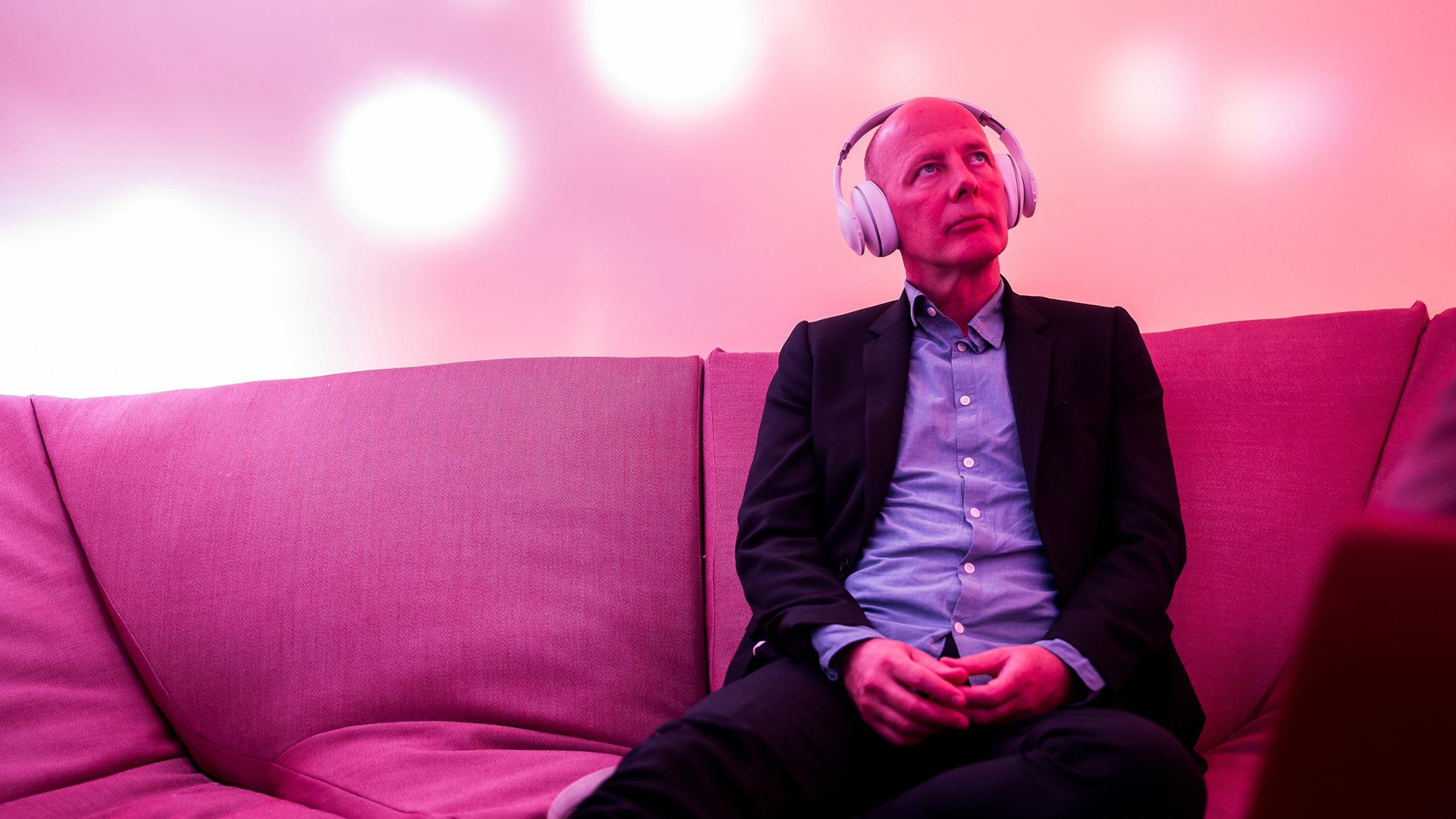
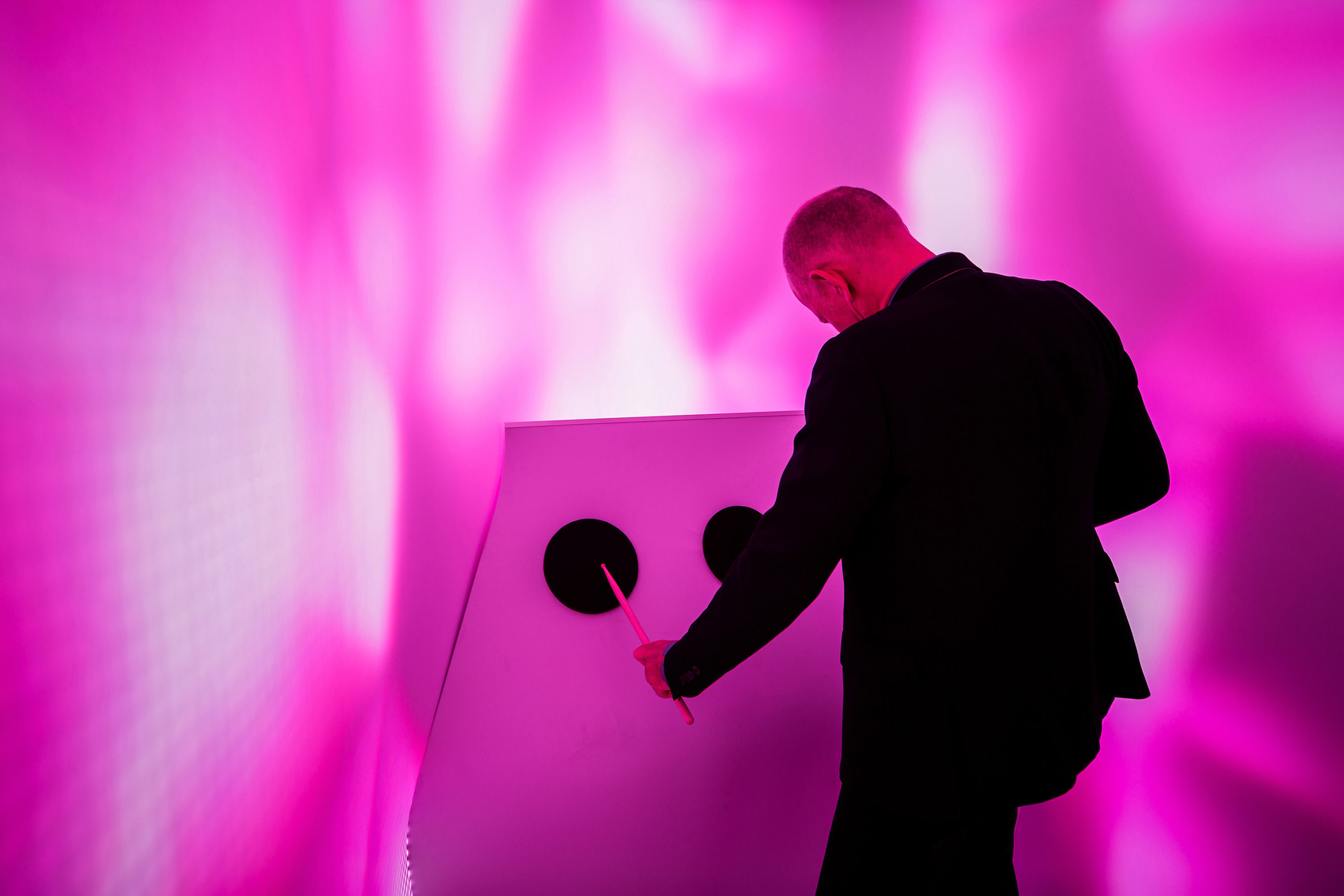
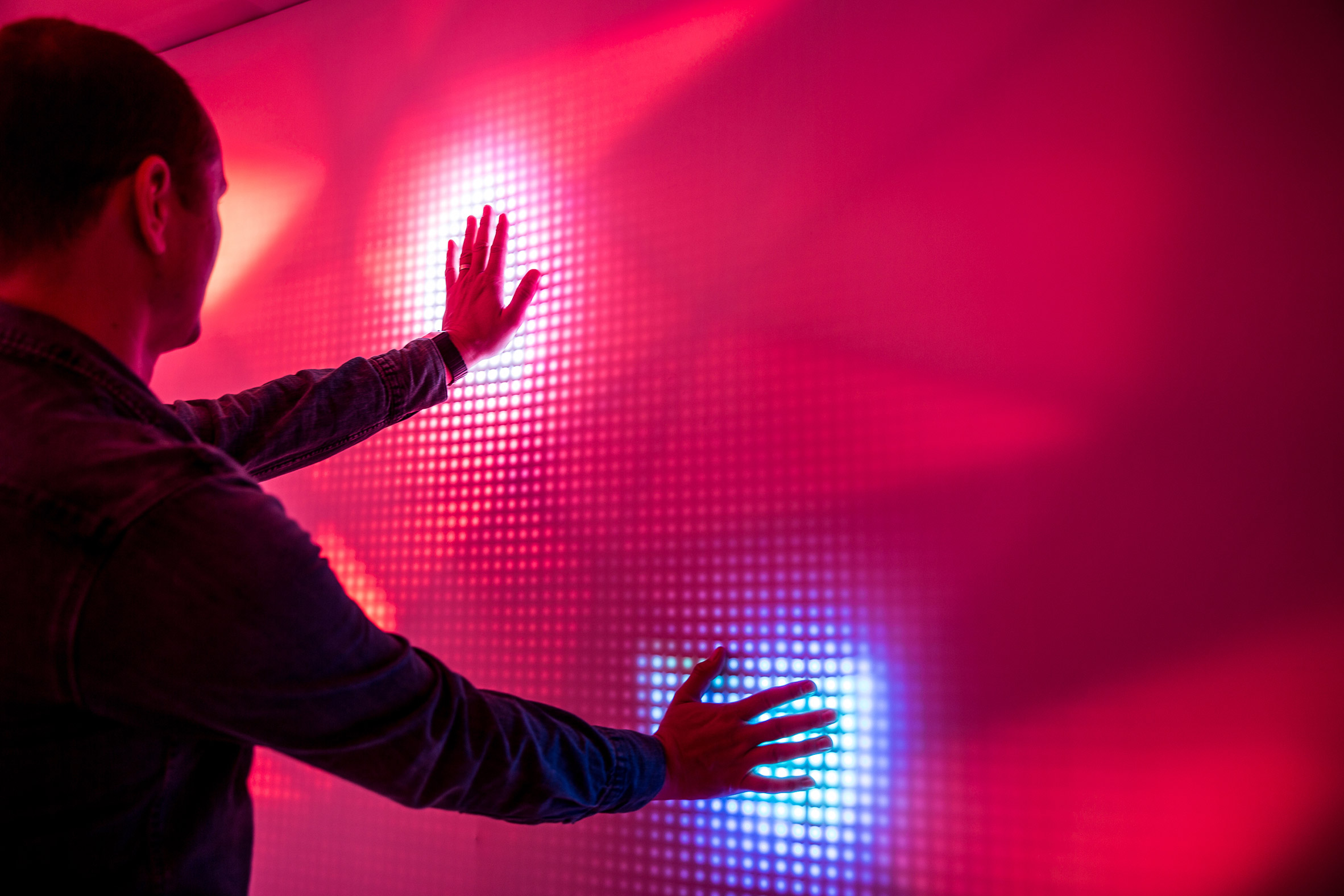
One way in which UNStudio and Scape are aiming to tackle this is with their pods which are being installed within workplace. These secluded pods will allow office workers to meditate, smash things or scream just to name a few, other activities include things like yoga or interacting with a wall that lights up when you touch it.


Oxytocin is released by sensory stimulation during different kinds of interactive behaviors and is linked to increased levels of social interaction, well-being and anti-stress effects. 'In addition oxytocin is released in response to low intensity stimulation of the skin, e.g., in response to touch, stroking, warm temperature, etc'. This is why things such as these pods are so effective in relieving stress and is a good basis for my research to get a better understanding of what I could potentially produce for this project.

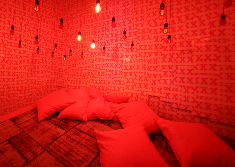
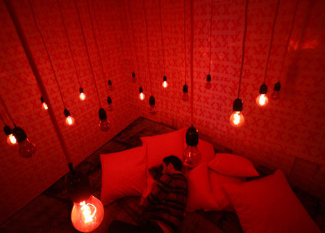
Napping is something specific that has been proven to reduce stress but it currently has a stigma surrounding it, as it's considered lazy and unproductive when it actual fact it can have health benefits. Architect Jürgen Mayer H has created a room filled with glowing pink light and ambient pink noise where people can nap and chill out. He suggests having a more nomadic sleeping arrangement where we frequently take naps as opposed to a long period of sleep like we typically would at night.

He explains in the article:
"..as the boundaries between work time and social time become blurred, the boundaries between sleeping and waking time will also become more flexible."

"I think 45-minute naps are a rhythm that's pretty good and works with your sleeping cycles. Ten minutes is also very good."


Even something as simple as a room like this to take naps in and chill out during the working day could be a good solution to my problem of stress, as there is plenty of research to suggest that napping does work.


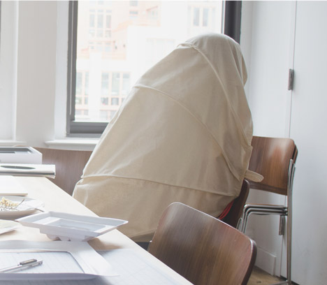
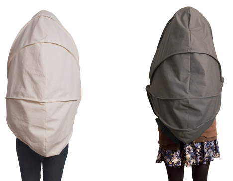
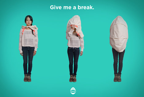
A much more portable solution to this problem is the 'Shroud', which helps workers reclaim "social solitude" during the day by shrouding them in fabric. Much rather than having a full room to nap or have time to yourself, instead you can have these moments wherever and whenever you please. This is a much cheaper and convenient alternative solution to stress, which is also something i'm going to consider; whether to visualise a full space or a product as a solution to my problem.

After moving to New York, the designer said:
"I was swept away by the city's never-ending activity and graduate school has been fast-paced and demanding."

"The Nutshell became my way of finding some personal peace and quiet, and I bet there are others out there who feel the same way."


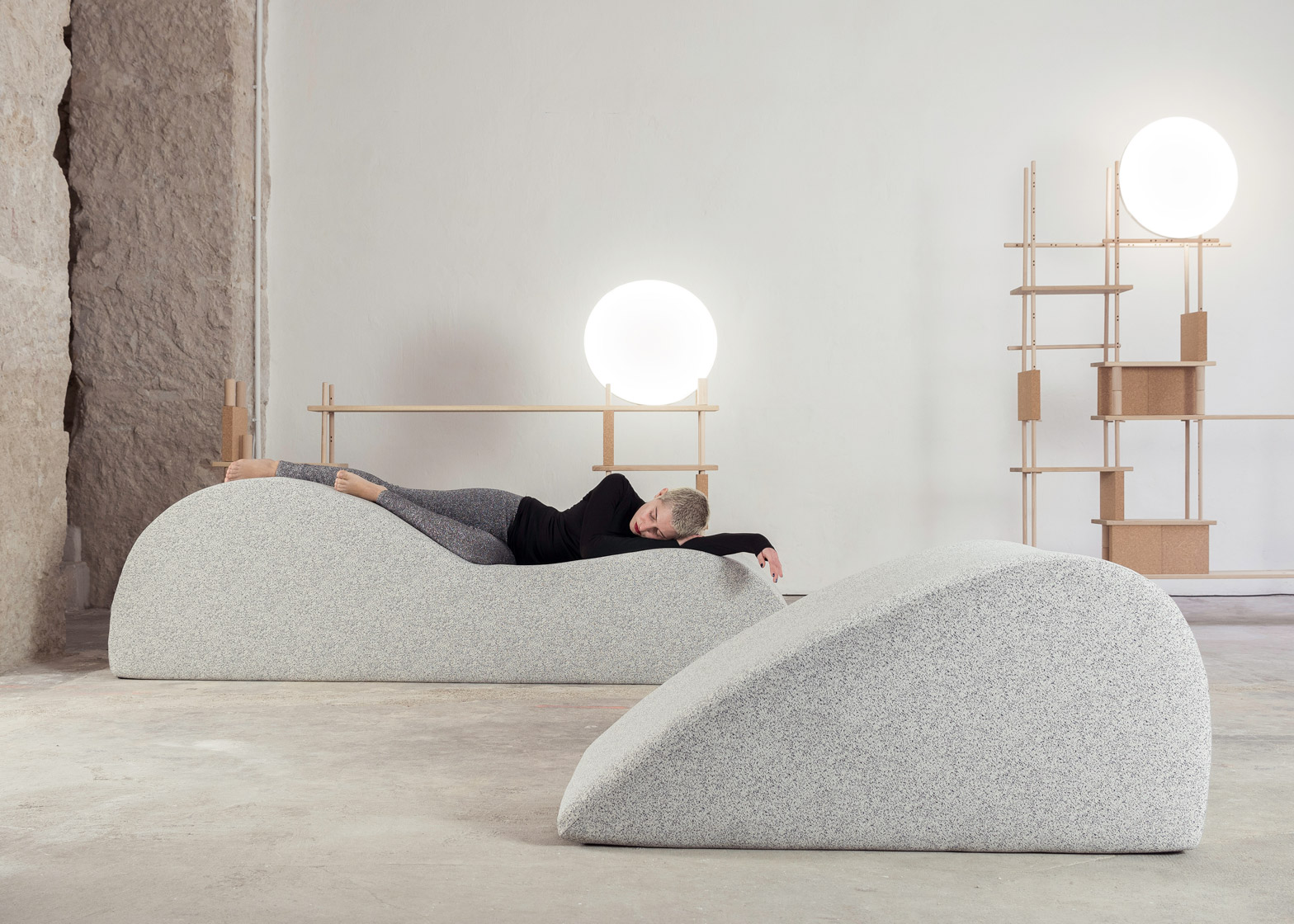
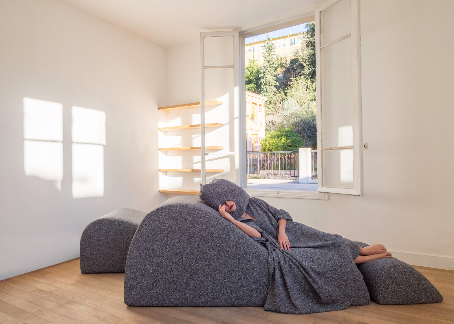
Over in Dubai, French furniture brand Smarin has created a temporary installation of soft dune-shaped lounge chairs, designed to encourage visitors to stop and take a nap. The idea is to allow visitors to "disconnect and recharge" because as the founder, Stephanie Marin...

"I had the idea for the Nap Bar because when I'm walking in big cities, sometimes I take a break with a coffee but actually I need more of a real break"

"In addition to furniture, the Nap Bar is furnished with latex-filled pillows – with holes in the middle for visitors to rest their faces – wool ponchos, herbal teas and essential oils."

The combination of these little things together create an relaxing experience for the user, one that will allow them to "disconnect and recharge" as the designer so intended. Creating an experience for the user I think is key to something like this, the environment and atmosphere that they're in needs to be naturally comforting, not forced in any way.


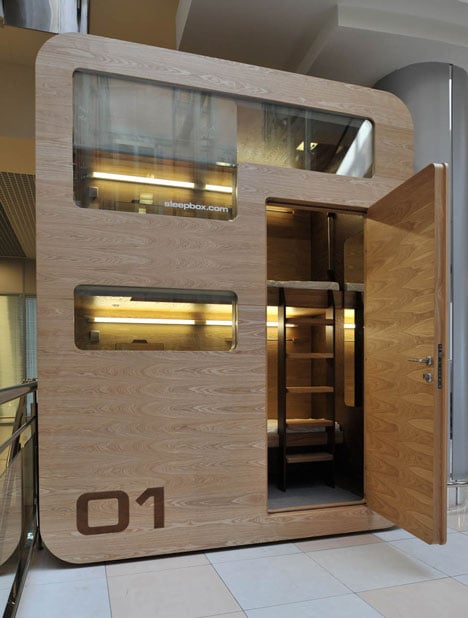
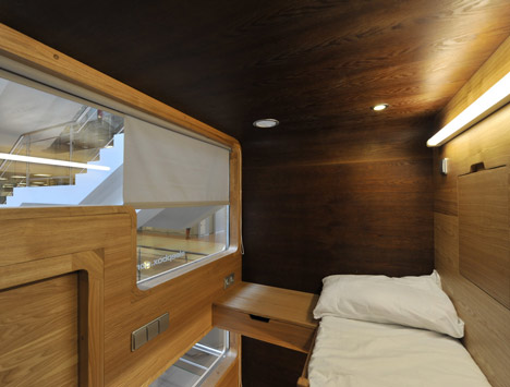
The Sleepbox is a small box equipped with two beds that allows people, usually travellers that don't have a hotel, to stay for 30 mins or a couple of hours to nap and recharge.

"Sleepbox allows everybody in unforeseen circumstances to spend a night safely and inexpensively or simply to kill a few hours without leaving the luggage."

The convenience of something like this is it's ability to just be placed anywhere there's space, in train stations, airports etc. where people may need to rest a little without having to get a hotel. I think this is potentially something that could be implemented into workspaces/universities as an option for people to de-stress and nap, meditate etc. although for only two beds per cabin, it would be expensive and space consuming.


London showroom Sto Werkstatt invited architecture offices Hassell and Draisci Studio to create an interactive exhibition exploring types of architectural spaces that can be used for short-term physical and mental rest. Sleeperie was the result of this.

"It encourages visitors to switch off mobile phones, tablets and laptops, and enjoy a quick daytime nap."

"Visitors can book in to the acoustically insulated room, for a 10-minute nap after work or between meetings."

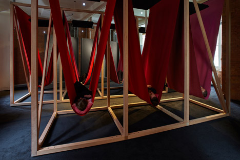
This is another solution to the never ending problem of lack of sleep that us designers face, by allowing us to rest and recharge both physically and mentally which ultimately helps with stress. This is something to consider for my solution, a room full of hammocks for people to rest could be feasible especially within the workplace or university as the material itself wouldn't be overly expensive, unlike for example the Sleepbox above.

All of these examples have been helpful in getting the ball rolling in terms of what's possible as a hypothetical outcome such as visualising a room for relaxation or potentially prototyping a physical product as the solution. I think the solution to stress, especially after researching into current solutions out there, is creating a space away from the work life within the workspace itself, so people can relax peacefully without having to go home which usually wouldn't be an option anyway.

Sources:


Wednesday, 26 April 2017

Feedback & Evaluation

As with every project it's always key to seek feedback for my final pieces because it can help to improve my practice and my future work overall. But also allows me to get an insight into how other people perceive my work and how they would have maybe gone about designing/producing it.

"The black type over the pink graphic makes for a strong, bold contrast which when coupled with the digital 90's style typeface works well in creating the unique look you was aiming for."


"One thing I would point out is some of the type appears as though it's floating on the poster, more so at the top of the page coming down."

"Have you considered how you're going to mount it? If it has to be mounted, maybe mounting it on a light grey or pink coloured stock would create a somewhat subtle contrast between the four sections and the background, whereas something like a black could ruin the look."

"I like how it's celebrating the facts of the whole parade such as the attendance and location. Whilst firstly celebrating the Leeds event, it also celebrates the previous Berlin events with the use of the strikethroughs."

How i'm going to mount it is something I really need to consider, if it's going to be mounted onto a flat surface mounting it onto some card won't be an issue but if for example it was to be hung or clipped up then this could be an issue. Maybe using string to hold the four pieces together if it's hung up could be an option to consider. Worst case scenario, I may have to use the full poster and it not in four pieces.


My final outcome for my poster was something I’m proud of given my worries about screenprinting prior to this project. Practicing this skill has improved my knowledge and my ability in traditional print.


The poster itself was bright and eye catching and I think will hopefully stand out within the exhibition. The pastel pink coupled with the white and black makes for a strong visual identity for Love Parade, evoking feelings of love and passion for the music.

This brief has allowed me to better understand the process of screenprint, which will benefit me a lot going into third year. Having the skill, confidently under my belt means it’s always a possible way of producing my outcome. 

Poster Photoshoot

Photographing my work to a professional standard is something I've somewhat neglected in the past, but is what I aim to focus more on this year. Taking high quality, appropriate photos is crucial to show my work in the best possible way for my portfolio and Behance, as this all reflects my effort put into the projects, having bad lighting and half assed photos reflects badly upon me.

I aimed to capture enough photos of the poster from all angles to ensure the details of the poster were captured. Using an infinity bed helped me to ensure smooth consistent photos.


In my last blog I discussed playing around with the poster almost like a jigsaw. I think considering that each section of the poster contains it's own important bit of information, the poster could still work when rearranged like this as it makes for an interesting visual.


Monday, 10 April 2017

Final Poster Outcome

I chose to screenprint my poster because I was confident that it would give me the clearest and more refined outcome, especially with all the typography and lines contained within the poster.

First layer done


Second/final layer done


The parade was a political demonstration for love and music and was to celebrate the people coming together. This is what the four separate pieces represent, when displayed the pieces will appear as though they're coming together as separate entities to one big entity to represent the unity between those who attended the festival.

I feel like because it's in four separate pieces it could be played around with like a jigsaw, the information isn't skewed in any way and it's still all within the poster but rearranging them creates different visuals, although not always that appealing.

Thursday, 6 April 2017

Developing Ideas

One big running theme throughout a lot of the event posters from the 90s was the whole 3D visual, with a grid that would create an environment within the poster. I took a liking to this because it gives the poster some depth and detail to it without it having to be over complicated with gradients and shades of different colours to suggest depth especially considering I was aiming to screenprint this design.


From the onset I was aiming to keep this poster relatively simple, reason for this was to contrast with the typical hectic look that a typical poster would have but to also allow the key bits of information to stand out. The shade of pink I'd chosen was something I think represented 'love' quite well without it being an obvious shade of bright red whilst it also allowed the black and white text/lines to stand prominent against it.


This was roughly how I envisioned the 4 posters to look together, each with their own big of information about the event and one corner of the heart so that when they come together it creates a complete poster. The combination of outlined text and block text I think helped to break up the monotonous use of the same typeface whilst also blending in better with the grid outlines.

Other Rough Ideas


I thought that duplicating the heart and having it as outlines would create a more 3D look that would give it more depth.


An idea that came to mind for this poster was to expand on this computer 3D theme by using a typeface reminiscent of the 90s, a pixelated type which I think fits in well given the lower quality resolution with screens back then.

Transferring this typeface over to use within what I felt was my strongest idea to this point, created a whole new look for the poster. The theme and concept was much stronger and more consistent to this point.


Given that the brief is about celebrating a past event, I thought that the having the attendance as a piece of information on there would emphasise this more. I wanted to also bring in the fact that this was an event that had been going on for many years up to this point and that it wasn't just a one off event, further celebrating it's triumph over the years. This is where the strikethrough years and also Berlin comes in, showing that this is just one of many of these events that has happened before.


Final Poster

A few bits of feedback from peers helped with the final resolution, suggestions were made to align both the Leeds/Berlin to create a more uniform look whilst also making the heart slightly smaller to isolate it and emphasise it more.

Tuesday, 4 April 2017

Visual Ideas & Influences

Following on from the last blog, talking about how techno brings people together it sparked an idea to create something that showed people coming together to appreciate the music. The original logo of the festival (shown below) I thought was something that could be altered and interpreted in a way that represents people coming together.


LoveParade Logo


Examples of LoveParade Posters
The posters for Love Parade at the time were very bright and warming, evoking a sense of belonging, like a family as it so obviously states on the poster. There's a heavy focus around people coming together to enjoy the music and rightly so considering it was a political demonstration for that exact reason. But I want to create something that still has this underlying concept but with a different visual focus.

Initial ides were to revolve the logo around a speaker, making that the centre piece in which everyone (represented by the circles of the logo) come together to appreciate. I thought about using the circles to represent an individual person which allowed for more abstract visuals with the circles coming closer together, more tightly packed to emphasise this idea of the love for music being shared amongst the people. 


Another idea was to focus the whole poster around the love heart from the logo, to represent the parade but also the shared love for music. This is where an idea to have four separate smaller posters that would come together as one big A3 poster, with each A5 piece having it's bit of information within it. The four separate pieces also would represent the unity between the people, with them coming together at the parade.


event posters from around the 90's and early 00's were all somewhat similar in a way, bright vibrant colours with a lot of game/computer influenced visuals such as grids, 3D objects etc.


I wanted to steer more away from the typical rave posters, with the use of a bright yellow colour and the smiley face that often accompanies it to hopefully create a different look for the event whilst still having the underlying theme of a rave.