Further Development of Current Ideas
Taking into account the points made in the feedback session, I went on to further develop my main ideas up to this point.
Idea 1
 |
| Original Sketch |
Inspiration for Development
Given that the underlying concept of my ideas are this idea of being worried and the connotations of being worried, I looked into some whimsically drawn illustrations since I felt that my idea is more illustration orientated.
The reason for this is that when worried or stressed I often become more clumsy, out of focus on tasks at hand etc. and so the 'carelessness' style of the work seems most relevant to my idea.
Rather than retaining the original drawing and adding colour to it, I decided creating a image traced alternative would create more of a distressed looked, again making the illustration more suited to the concept.
I originally experimented with block colour layered under the artwork, making it slightly uneven to match the style similar to the artwork above.
But it still looked too neat and even and so using the brush tool meant I was able to create a much more un even and jagged look.
 |
| Final Idea 1 |
This style of work suggests anxiousness, given the scruffy nature of it. It communicates a worried being due to the carelessness of the colouring in of drawing.
Idea 2
 |
| Original Sketch |
Inspiration for Development
Whilst looking further into microvessels and things under a microscope, I stumbled across a few pieces of work that caught my eye due to their abstract appearance. This inspired me to develop my idea into something different and harness some of the colours and style of these photographs, in the hope to make my design stand out against others.
 |
| Final Idea 2 |
The underlying concept behind the wacky colours and disorientated composition is that it is representative of a worried mind, with the different layers being different thoughts that are causing said anxiousness.
Idea 3
With this idea, the design appears very distressing due to it's complex mix of textures and distorted lines. The overarching theme of this was to give the appearance of shattered glass as often shattering glass or other objects can be result of anger/stress, often caused by worrying about particular things.
I wanted to retain this look but add further effects such as shadow and noise to complete the dark and distressed design.
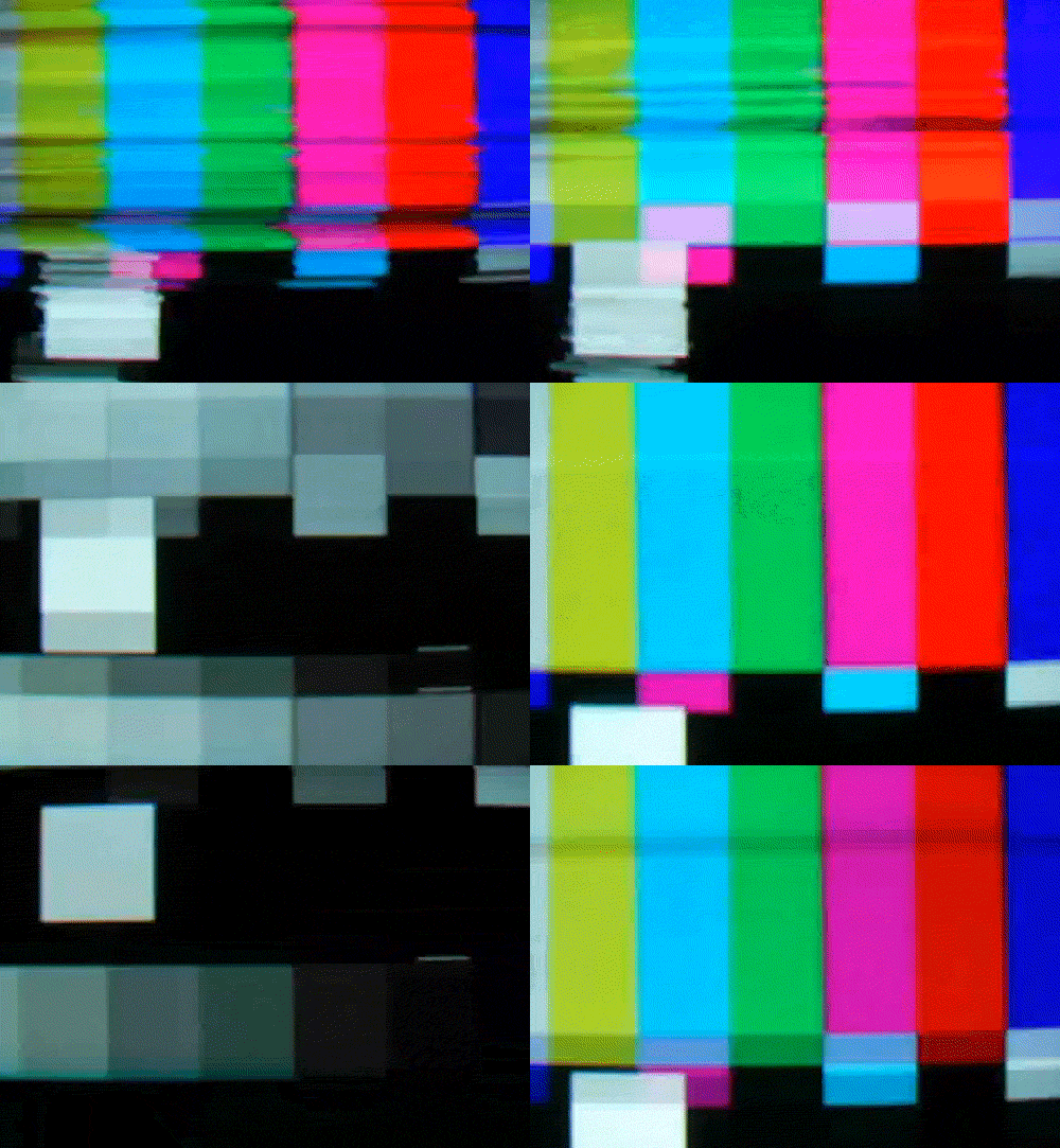
After having a quick think, whilst watching TV, about situations in which someone could be stressed, it clicked that a lot of the time even something simple as watching watching TV can stress people out. In some cases, so much so that people go as far as to damage or break their TV, which I thought looks very much like my current design.
I thought of creating a distorted broken TV look and by incorporating a red overlay, that would further emphasise feelings of stress and anger.
 |
| Final Idea 3 |
Idea 4
As much as the sketchiness of this design already evokes feelings of worry and unease, I wanted to develop it further by adding relevant colours and creating a much higher contrast between the strokes and white space.
Originally I gave the design a dark and deep red look to accentuate the dark and looming passageway that is representative of a worrying person's mind but a friend pointed out to possibly try a lighter background to make the strokes sharper and harsher as opposed to blending in given that they're a similar colour.
 |
| Final Idea 4 |
New Idea (Idea 5)
One idea that was briefly mentioned in the first feedback session was something to do with a stress ball and so an idea that came to mind was to capture a hand grasping a stress ball firmly. Ultimately this would then be manipulated and effects added to it to create a darker and more stressed surrounding as illustrated in the sketch above.
First Attempt
For the first attempt, I made a stress ball simply out of flour and a balloon to fit the size of my hand as a regular sized stress ball would be too small in relation to the rest of the hand.
The only problem with the photos taken to use for this idea was that there doesn't appear to be much tension on the stress ball itself and so doesn't fully evoke the feeling of worry/stress that would make this a strong idea.
Given there was not at all much texture or tension going on within the photo, I decided to manipulate it in the hope to bring light to the underlying concept.
An idea I had was to focus on the contours of the hand and the stress ball themselves as often these highlight the different highs and lows of any object and would bring texture and depth to the flat design.
Different Styles of Contours
 |
| Final Idea 5 |
The background was something else I made adjustments, adding both texture and colour to it, so that the dark colour scheme would flow better together.


No comments:
Post a Comment