A lot of her work is based on more tactile photography; pictures that are usually physically altered or tampered with in some way to create a new composition or another edition of the original photo. She mentioned about her identity being something adaptable and responsive to it's given environment.
Examples of her work
Although a lot of her work encompasses a lot of sharp, contrasting colours, the use of colour within her identity will be limited for a number of reasons. Mostly to allow for the photography itself to stand prominent but also because too much colour could become overwhelming when occompanied with the photos on the website for example. Although there is potential for one or two colours to be used as highlights that form part of her visual identity.
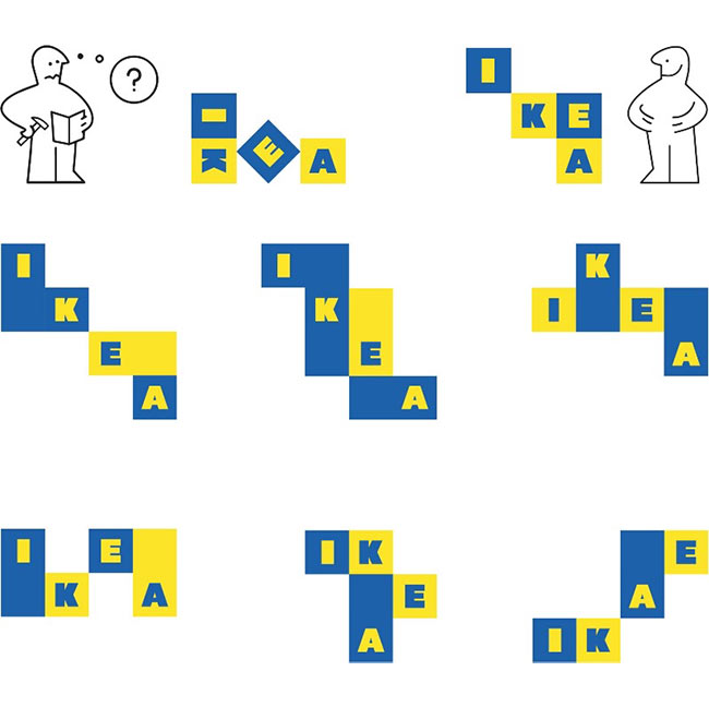
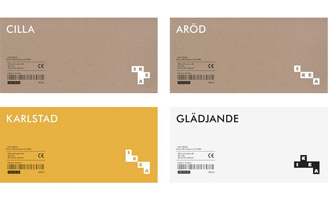
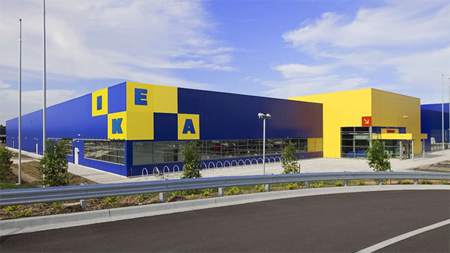
Examples of responsive branding
Ikea concept rebrand
Whitney Museum
DOGA Norway
These examples display adaptiveness depending on their situation which is something I aim for when creating this identity.
Deliverables
- Website
- Promotional Pack; Business cards, postcards etc.
- More TBC.
As for the deliverables, Hilda sent me a pinboard of inspiration for ideas that are similar to what she had in mind for her branding.
A lot of the inspiration follows a minimal, yet characterful look which I feel is an accurate representation of her photos; encapsulating colour and lines.


No comments:
Post a Comment