


That coupled with her interest for manipulating her photos, be that physically or digitally, sparked up an idea to work with basic shapes and lines as the core principle of her branding with light use of colour.

 |
| Concept behind this work was to fold out the imperfections within the photographs. |
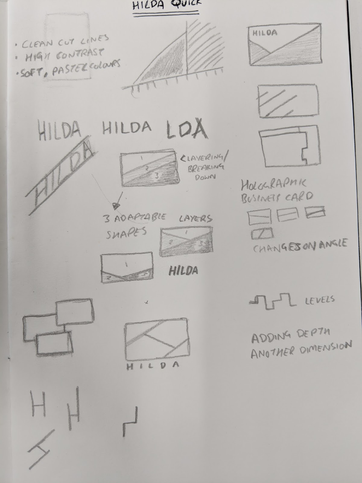

Some of my initial quick sketches revolved around this idea of adding an extra dimension to her branding; adding more depth to the visual identity. This was based off the work shown above where by the physical manipulation of the photographs immeditately added third dimension but also another interesting aspect to the images. She plans to focus her future work around this concept of manipulating the photos in some way. Because of this I want to focus her branding around this idea in some way.
My underlying concept is to work around the ideas of adaptability, responsivness and depth within the visual identity.
Working with simplistic shapes, lines and colours I aim to create something that can adapt to any given environment (be that business cards, postcards or online e.g. a website) without being consistently the same visuals within each format.
No comments:
Post a Comment