

Blue is another option as it invokes rest and can cause the body to produce chemicals that are calming and exude feelings of tranquility.

The colour purple has a variety of effects on the mind and body, including uplifting spirits and calming the mind and nerves.
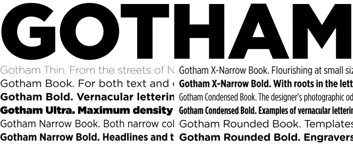
The typeface(s) of the brand are another big important consideration as these often contribute to people's perception of a brand. For this, given my calm, simplistic brand values it makes sense to me to go for a simple sans serif typeface that evokes stillness.
Gotham
Helvetica

Circular

Noway

Semcon

Geomanist

Brandon Grotesque

All these typefaces are good options for what I aim to portray within the brand; a soft, clear, tranquil look that evokes stillness.


Cocoon
The Concept
I chose to go with the name cocoon because of the connotation it has. The process of a caterpillar turning into a butterfly by going into the isolation of it's cocoon and changing during the process. This is in a way what I'm aiming to do with my product, for people to enter in one state (stressed) and exit in a better state (less stressed).

A rough look into how I was thinking of how to structure the type of the logo. Straight away I established that using capitals has the opposite effect of what I was aiming for, a calm, soothing look. I found that adjusting the kerning to create a more open space between each letter created a more drawn out, more distilled look, almost like ripples in water. I wanted to use a typeface that wasn't too narrow and instead was a more rounded look to match with the spherical shape of the chair.


I began to come up with a few rough sketches of my logo, that revolves around this soft, rounded look of the chair and also the shape of cocoon. The reason for the lines was to give the logo a spherical look, creating a more 3D appearance whilst also replicating the front view of the chair with the ribs of the pull over cover. This straight away will make the link between the physical look of the product and the brand creating an recognisable identity.

No comments:
Post a Comment