Friday 30 March 2018

Brief 3: Making decisions on how to print business cards

The decision for printing the business cards was between ordering them, maybe through someone like MOO or manually printing them myself. We both decided that it would be more fun, experimental and worthwhile knowledge printing them manually. Given the previous contacts and prices Alec had given me for letterpress blocks for business cards, I made contact with multiple manufacturers.


I was after 4 metal plates (3 front designs and 1 back design) that would be mounted onto wood to ensure they were type heigh, meaning that I could use them in the ADANA presses in the letterpress room.

Both estimates came in around the same price (~£50) so I decided to go with the original contact Alec gave me as I had confidence in a high-quality product since he himself had used this company in the past.

The metal backed plates

These arrived the day after ordering them which meant I could quickly get to grips with using them in the letterpress room with a little help from the staff working in the traditional print room.

Brief 2: Evaluation

Working in a physical format has always been an interest of mine, being able to appreciate the work created with your own hands holds more value to me. This was one of those briefs. Both me and Courtney had multiple ideas for this project, so working collaboratively seemed a good way to combine these. This was an environmentally driven brief which is in fitting with my design ethos. I enjoyed experimenting with different and abstract ways of visualising our idea, mocking up vacuum packed chicken was a new experience.

This brief started off strong then was set back for a month or so whilst me and Courtney put our focus into our dissertation which resulted in a shorter time-frame to put together the physical piece itself. This was an oversight but was rectified when we managed to produce the piece within a matter of days ahead of submission to Starpack. Booking print slots and managing smaller tasks between the two of us helped to speed up the process, through using a day by day timetable.

Something that I would have done differently is to explore more packaging option to optimise it’s portability and also to experiment with more finishing techniques to increase it’s appeal.

Since submitting we received confirmation that we were shortlisted for the competition which is exciting to see our idea being acknowledged as something feasible and real world solution to the proposed problem.

Brief 1: Email to send out to charities for first hand research

Hi there,

We are currently working on a project that explores the relationship between local charities and their donators, to better understand the connections and conversations that go on between the two.

Our plan is to develop a platform that brings closer together donators and local charities, creating stronger bonds between them whilst also increasing their awareness to the local public.

The platform aims to give organisations a bigger voice which will enable them to spread the good word of their giving nature, whilst also informing people the extensive power of giving. All the while the platform aims to make the process of giving more smooth and efficient for both parties involved.

Below are a few questions, if you have a moment to answer them, be that as many as you see fit, it would be hugely appreciated. Your answers will give us a first-hand understanding of charities, all in the hope to develop something that truly recognises the good and potential obstacles of an organisation like yourselves.

Thankyou in advance,
Have a great day,
Elliott and Jonathan

Questions:

1. What, if any, problems do you come across on a regular basis when seeking donations?

2. Where do you receive the most donations? (E.g. on street, online, investors/grants etc.)

3. Do you feel there are more effective ways to help out a charity than simply to donate money?

4. Do you think there are ways that the collection of donations could be improved?

5. What are the main overheads of running a charity?

6. Do you think that transparency within charities can help increase people's trust within them?

7. Are you open to the idea of charities being transparent with their business workings?

8. What, if any, platforms do you use to communicate your charity? (E.g. Facebook, JustGiving, Twitter etc.)

9. Do you think that there is an opportunity for an open platform that would both; help create a smoother method of campaigning for charities and an easier, more efficient donating process for the public?

Monday 26 March 2018

Brief 3: Time plan w/c 26/03


With such a tight deadline, we planned out time efficiently so that we can produce as much work as possible within a couple of days.

Sunday 25 March 2018

Brief 4: Evaluation

This was the biggest collaboration of the module, working with three other graphic designers. This was a good and sometimes bad aspect of this project. Having 4 creatives who work in a similar way meant that from start to finish the project ran quickly and efficiently. But the drawback was that our skillsets were somewhat similar, which caused some clashes between members. It did however mean that our timetables were aligned allowing for easy scheduling of our time for the brief. I thought that, although we were all graphic designers, we all played to our own strengths which helped to speed up the whole development process.

The video campaign edited by myself meant that I learnt new software, Adobe Premiere Pro. I felt the time spent working on this developed my capabilities on the programme which then transferred over into some of my later briefs.

Our outcome we felt was an appropriate outcome to help tackle the problem of waste food, more specifically the stigma regarding wonky vegetables. The different elements that make up the campaign not only address the issue but actively works towards change the public’s view of wonky produce, whilst giving them an incentive to buy differently. With Beth being able to illustrate aspects of the video, this helped to create a more engaging campaign through her wonky drawings.

Monday 19 March 2018

Brief 3: Developing a Promotional Pack

Promotional Pack

Plan for content of pack
Hilda requested only a few basic things within her pack be that business cards, postcards and a poster. Having it roughly A6 size will mean it'll be slim and easy to post off to people she wishes.

Few ideas of design layout
My intitial idea consisted of the pack opening from the top similar to this design below as the pack could open along a line; that being consistent with her branding.


Second idea was similar format but instead opens like a book. There are three sections to this to hold the three different elements; poster, business cards and postcards.

The poster sits tucked away underneath both the business cards and postcards, whilst those two sit partially visible on top, only covered by the cover that holds them in place. These covers are angled to bring through her visual branding into the physical promotion pack. Underneath these covers will be simple cut out semi circles where the cards can fit in to be held in place.


Potential Net

First net mockup


Thursday 15 March 2018

Brief 4: Final campaign video


We were all really pleased with how the video ended up looking in the end. We felt that it communicated our concept clear and concisely in a visually pleasing way.


Tuesday 13 March 2018

Brief 3: Feedback on current ideas

Looking at the current idea of using translucent stock and creating this sense of depth and layers, much like within her photographs, I had a few personal worries myself on how this would actually work. So I sought feedback to see what others thought.

- Possibly use spray mount to layer the stock together - would hopefully create a clear hold without the visible glue marks that other glues might have.

- The business card itself could possibly be something that is intrinsically useful, something that a photographer keeps on them at all times.

- With this idea of translucent stock, maybe the business card could be use as a level to help visualise the lines before taking a photo. Almost like the business card is a level for ensuring a level photograph.

Speaking with Alec I also received a lot of useful feedback.

- Having three cards together, essentially a triplex business card, could be tricky by hand but also bulky. Maybe having three separate business cards that come together in some way would work better.

- As a result have a look at card holders, possibly think about creating your own way of holding these together. 

- Create a language from her branding. This simple line concept can be transferred into every platform and piece of collateral: email footers, letter head, invoices, website, social media, postcards etc. Not just necessarily within the business cards. So that when all of her branding is seen together, it would work universally.

- Although the translucent stock idea could and would work, the reproducibility of this when out of my own hands is going to be much harder on Hilda's part. Plus also it would require finding a really nicely finished translucent stock, which is hard to come by.

So maybe revert back to using opaque stock and utilise printing techniques such as embossing to keep consistent this very simple, minimal concept for her branding. Keep with the idea of handing out three at a time within promotional packs and such as it's still a means of helping spread her brand.

Assessing the Costs

From Alec:
Here are a few contacts I used when creating my business cards:

Photocast Products LTD Liverpool - From these I got the cheap plates to emboss my business cards with. Around £24 for three metal plates.

Chrisp Printers - Around £120 for 200 business cards using the plates and stock from the company. Recommend bringing your own stock to ensure quality and finish you're after.

Saturday 10 March 2018

Brief 4: Stopmotion filming & editing

For our video we decided upon a stop-motion style that would consist of paper being 'peeled' back to reveal another piece of paper, a visual metaphor for 'it's what's on the inside that counts' which is the whole underlying concept behind our idea.


That coupled with illustrations from Beth and the voiceover from Jaz that me and Jon recorded and edited, I put together our campaign video in Adobe Premiere Pro. This was relatively new software to me, but the process helped me understand it better and by the end I felt much more confident using it.

For the voiceover we had to use Audacity and a range of different bits of equipment that was set up in the recording studios. This was new to us, but we quickly got to grips with it and was able to cut up the voice clips so that they flowed smoothly together.

Friday 9 March 2018

Brief 4: Proposed Script

Introducing .... Hellman's #withwonky, a nationwide tour proving to food lovers that despite not being the hottest of the harvest, wonky fruit and veg tastes just as great.

Hellmann's are on the side of food, no matter how lumpy, bumpy or blemished because we believe it's what's on the inside that counts.

Over 7 million tonnes of food gets thrown away before even reaching the supermarket based on how it looks despite being a 10/10 on the inside. We aim to change all that.

We'll be touring the UK, around music festivals, freshers fairs and city centres near you with our wonky food van,  making delicious meals out of the discarded veg that no-one else would give a chance, to prove that it's not the jacket it's the 'tater and that beauty is only peel deep.

As well as being able to track the van online you'll be able to see how many tonnes of wonky veg we have saved from going to landfill. Any leftover food will be donated to the salvation army to ensure that not a single scrap is wasted.

Once you're a wonky veg covert you'll be left hungry for more, therefore we've teamed up with supermarkets nationwide to provide a Hellman's voucher for our delicious range of condiments with every wonky veg purchase.

I'm #withwonky
We're #withwonky
Cooking #withwonky
Cambridge #withwonky
Bestival #withwonky
Glastonbury #withwonky
Manchester #withwonky
Hellmans #withwonky

Brief 4: Hellmann's With Wonky branding

For the branding of the campaign we wanted the type to be representative of the wonky veg we're promoting. By manually adjusting each letterform we were able to create something that we felt was an accurate visualisation of wonky veg.


final logo

In the end, we merged our chosen colours with a slightly wonky typeface that we altered to fit with our concept.

The brightly coloured van makes use of our campaign colours that will help to make the food truck stand out at a festival, city centre etc. hopefully catching people's eyes.

Thursday 8 March 2018

Brief 4: Campaign Video Ideas

The brief states two options to present our idea: 1 minute video with an option of 8 design board JPEGs OR 2 minute video and 4 JPEGs. 

We ideally wanted to aim for the shorter video so we had more of an option to explain our idea through static visuals such as the food truck, campaign, packaging, menu etc.

Idea 1 - Paper crafted food trunk van adventure

Our first main idea for the campaign was to work with crafted paper in the form of a food truck and accompanying vegetables. 


We would create a small landscape out of pieces of hand crafted wonky veg and animate the crafted food van travelling along this. All the while behind the van in the background would appear parts of the script that stand out as key facts or figures e.g. that 7 millions tonnes of food a year gets scrapped before even making it to the supermarkets.

This idea would lead the audience on a journey through our idea, the same way our food truck will be going on a journey around the UK hopefully influencing that same audience to convert to wonky veg.

Idea 2 - Stop motion paper animation


Our second idea was a more 2D visual that involved tearing (peeling) paper with a potato peeler. Each scene would contain a different illustration to help visualise the voiceover that would accompany it. This would be done in a stop motion style to add to the rough, imperfect visual we're going for to align with the wonky veg.

Brief 4: Campaign Branding Ideas

For the branding of the food truck, we felt it had to focus on the word wonky to make sure our message was clear. 

Get Wonky

Get Wonky was a fun playful idea we had to suggest that people 'get wonky' by eating and using wonky fruit and veg in their meals. We felt this would tie in well with abstract visuals and bright colours and would work especially well in the settings of festivals and such. Hitting a younger demographic that wonky food would typically go unnoticed to.

After some googling, we soon realised this was already an established brand.


With Wonky - #WithWonky

This new slogan instead implies that people stand on the side of wonky veg, the same way Hellmans are already 'on the side of food' as such this aligns with their already existing values.

The idea has potential transfer over to social media to involve people on all platforms by them showing their involvement and support of wonky veg.

Elliott's #WithWonky
Bethan's #WithWonky
Manchester's #WithWonky
Hellmans #WithWonky

Brief 2: Photoshoot of packaging


Wednesday 7 March 2018

Brief 3: Development of idea


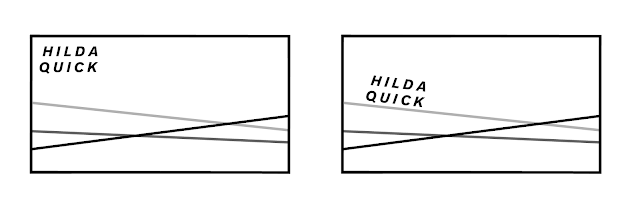
Looking back at her images individually they all have something in common; lines. These are created in a number of ways through contrasting colours, objects or a combination of the two. As a result there is a consistent visual theme running through her photos which can be seen above.


Working from this theme I created a concept of one consistent line that runs throughout her work into her visual branding.


As an example, above is three examples of different business card designs that follow the theme from earlier pictures in the blog. There would be three slightly different designs, the only difference being the angle of the lines.

For the stock I had the thought of using translucent stock from GF Smith. This would allow for me to layer the business cards together to create a composition of lines that intersect to create a different visual than they would create on their own.


The design doesn't necessarily limit her to one particular area of expertise as this is something she mentioned to me previously; she wanted to maybe also explore curation.

Another thing she previously mentioned was that she isn't too good or confident with networking and getting her name and identity out there. This is something I feel could work well with this current idea for two reasons:

- The abstract nature of the business card(s) will hopefully create some conversation around herself upon initial impact.
- With there being three cards handed out in promotional packs and such it will mean one for the recipient, with the opportunity for the other two to be handed out to others as a means of spreading her brand for her. Almost like another way of getting around through word of mouth.

Meeting with Hilda:


During the short meeting we had, Hilda presented a few visual ideas as alternatives or expansions of the current idea we had.


One idea thought of the business cards being constructed from multiple layers of stock that would be dye cut in their own shape, that when brought together, would replicate her style of photography with the sharp, angular contrasts.


Another idea was almost the reverse of this. Having three rectangular business cards that have different shapes cut out of them to again recreate the intersections seen within her images.


Looking at postcard design, as an idea we thought of carrying through this concept of sharp contrasting lines by replicating the lines from one image to the reverse side of the postcard to ensure consistency of her branding across all collateral.


One thing I'm going to consider from this point onwards is to start to visualise the branding across all platforms and collateral to help develop the identity further and solidify her brand image.

Tuesday 6 March 2018

Brief 2: Production of packaging

To mock up the vacuum-packed chicken, we used two plastic pockets that we opened up and laid out flat. Then by marking on our already calculated measurements, we put the wrapped chicken in place.  Then after layering the other piece of plastic on top, we used a hot glue gun to seal the packaging. This proved difficult but we got there in the end.


We then trimmed down the excess and tucked under the outer rims


Working prototype of both sleeve and vacuum packed produce.


The idea of RIP ME. FREEZE ME. COOK ME. EAT ME. Stemmed from wanting to easily and simply communicate how our packaging can make consumer's lives easier by being able to eat one at a time, and freeze the rest to keep them fresh for longer.

final net
We decided on an already recycled stock so that we could make use of old recycled paper but also to give us a luxury aesthetic when coupled with the black type.