Looking back at her images individually they all have something in common; lines. These are created in a number of ways through contrasting colours, objects or a combination of the two. As a result there is a consistent visual theme running through her photos which can be seen above.
Working from this theme I created a concept of one consistent line that runs throughout her work into her visual branding.
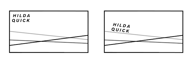
As an example, above is three examples of different business card designs that follow the theme from earlier pictures in the blog. There would be three slightly different designs, the only difference being the angle of the lines.
For the stock I had the thought of using translucent stock from GF Smith. This would allow for me to layer the business cards together to create a composition of lines that intersect to create a different visual than they would create on their own.
The design doesn't necessarily limit her to one particular area of expertise as this is something she mentioned to me previously; she wanted to maybe also explore curation.
Another thing she previously mentioned was that she isn't too good or confident with networking and getting her name and identity out there. This is something I feel could work well with this current idea for two reasons:
- The abstract nature of the business card(s) will hopefully create some conversation around herself upon initial impact.
- With there being three cards handed out in promotional packs and such it will mean one for the recipient, with the opportunity for the other two to be handed out to others as a means of spreading her brand for her. Almost like another way of getting around through word of mouth.
Meeting with Hilda:
During the short meeting we had, Hilda presented a few visual ideas as alternatives or expansions of the current idea we had.
One idea thought of the business cards being constructed from multiple layers of stock that would be dye cut in their own shape, that when brought together, would replicate her style of photography with the sharp, angular contrasts.
Another idea was almost the reverse of this. Having three rectangular business cards that have different shapes cut out of them to again recreate the intersections seen within her images.
Looking at postcard design, as an idea we thought of carrying through this concept of sharp contrasting lines by replicating the lines from one image to the reverse side of the postcard to ensure consistency of her branding across all collateral.
One thing I'm going to consider from this point onwards is to start to visualise the branding across all platforms and collateral to help develop the identity further and solidify her brand image.


No comments:
Post a Comment