Friday 29 April 2016

OUGD406: Studio Brief 03 - Exhibition Branding (Evaluation)

Although I’ve worked in groups on one or two briefs earlier on within the year it wasn’t as substantial and in depth as this one. Working within a group allowed for us to put ideas together to create something a much stronger and appropriate brand for the exhibition, something that wouldn’t be as easily achieved on our own.

But there were some drawbacks to working within a group, the most obvious one being time management between us. Organising times to meet up when everyone was free and not busy working on other briefs meant that it was sometimes tricky to get together and develop our concepts further. We were able to manage our time to the best of our abilities whilst working around other briefs, through the use of a Facebook group which allowed us to keep in contact and organising to meet up.

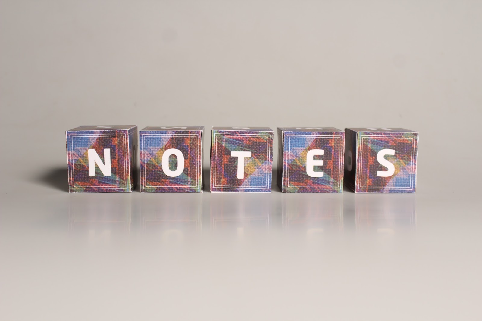
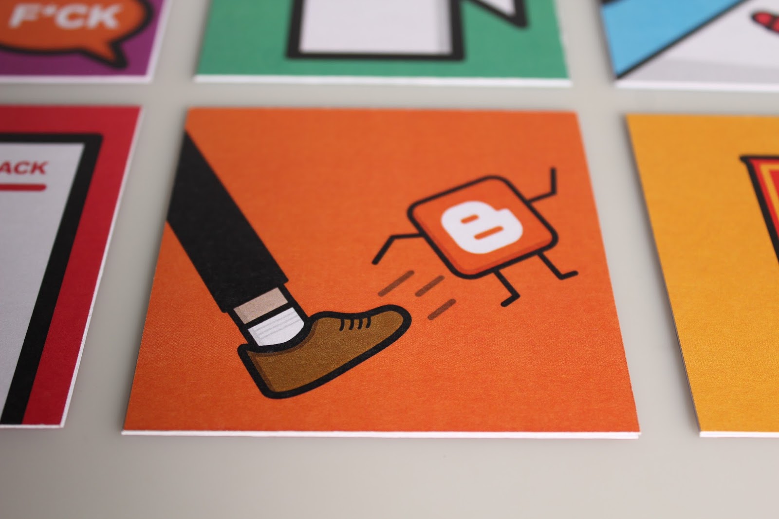
I think that our final physically produced pieces were well produced, printing onto both thick stock and acetate gave a range of looks. Having the window decal as well to inject light into the room is something that I think will hopefully allow for our underlying concept to stand prominent amungst the other presentations.


The high quality end product photographs are another thing that I hope will show to the judges how much effort and time we as a group have put into the whole project, working collaboratively together to produce a strong exhibition brand.

Thursday 28 April 2016

OUGD406: Studio Brief 03 - Exhibition Branding (Photoshoot)


Once the physical pieces had been produced and printed, I took them over to a photography studio and took roughly 170 photos trying to capture the each little aspect of both the posters invitations and the box models. From those I selected a handful of photos that I thought were high enough quality to present within our presentation pitch.

OUGD406: Studio Brief 03 - Exhibition Branding (Exhibition Poster, Invites & Box Net)

Poster Design


Final Poster Design

Anna worked through a few different arrangements for the exhibition poster, but the final one we decided upon was the clearest and allowed for the main logo of the exhibition to stand prominent within the centre of the poster with the smaller time and date information in one corner.


Box Net


With the box net we planned on printing out 5 of these and using these to mockup how it would look full scale within the actual exhibition space.

Invitations Design


Final Invitation Design

Two designs for the invitation were created and we ultimately decided upon the white one as the black one seemed too dominant and felt like it was taking away from the text. It also meant that the white background ran through into the front of the invitation with the white text and box outlines.

Keeping this square theme running throughout the whole of our branding kept it consistent and meant that the poster and invitations matched. 

OUGD406: Studio Brief 04 - Speaking from Experience (Evaluation)

Out of every brief completed so far this year, I would say that this has been the most enojoyable simply because it’s been based all around the past 6-8 months spent at university and on this course. The people I’ve met and worked with throughout the time on the course have all gone on to influence this brief, through their quotes on day to day life.

The final content of the piece is a mixture of common quotes but also ones that will actually go towards advising the first years coming to uni next year. Quotes such as ‘Book your print slots now’ will genuinely be helpful for new students as this is something I naively ignored at the beginning of the year.

My whole aim for this brief was to create an entertaining piece that would interest students into reading it, but also within the process of making it, I managed to turn it into something useful as these can be used as tea/coffee coasters within the studio or within their own flats, and will hopefully act as a constant reminder of what to expect within first year.

Creating the final piece was something that I enjoyed as I much prefer creating a physical piece but also I’m very much interesting in packaging and so making packaging for the coasters was an enjoyable yet challenging process.


I think that the colours work well in conjunction with each other as not only do they contrast well enough to be eye catching but they fit perfectly with the tongue and cheek content of the whole piece. The typeface I used also fits with the piece as it’s bold and striking much like the illustrations and colour scheme used.

After presenting my final peice to a couple of peers, one thing that was pointed was with the content of the piece. They said that only really one coaster was advisory with the rest being quotes from other students, maybe if I had done a half and half split of both advice and entertaining quotes it would have made for a more informative piece which would have ultimately been more useful to first year students.

A few suggestions were along the lines of ‘A blog a day keeps the stress away’ and potentially others that talk about where to shop, or go out in leeds for food, drinks etc. Having other pieces including this would have made for a much more useful set of coasters rather than being purely entertaining.

OUGD406: Studio Brief 04 - Speaking from Experience (Photoshoot)


OUGD406: Studio Brief 04 - Speaking from Experience (Development & Production)

During the process of developing each little illustration I decided to change my mind upon the content of the tea coasters, rather than bits of advice such as 'shop at Aldi' I thought I would go more down the route of an entertaining piece and use entirely quotes taken from first year students.

The final quotes I settled on:

- "F*ck it, shall we just go La Fonte?"
- "First year doesn't count anyway"
- "Beware of blogger, it's a temperamental little sh*t"
- "You'll be dribbling like a baby after your second sip"
- "Book your print slots now"
- "How many design boards you done?"

As for the actual designs of the coasters, I decided to go with a vibrant colour scheme so that this would stand out on different surfaces whether that be within the studio or in the flat etc.

Example of Colourful Coaster
Given that there are several of these, I thought that I could create a box to hold them as a pack together. Since some of the quotes are advice that the student would take away from this, the box I wanted to go for was similar to a pizza box in the way it opens to represent this idea of taking away advice.


Box Net
Box Net Test


Box Design


Test Print


Test printing involved making sure that both the box net worked properly but also to ensure that the coasters inside would fit well.


Final Print