 |
| Golden Canon |
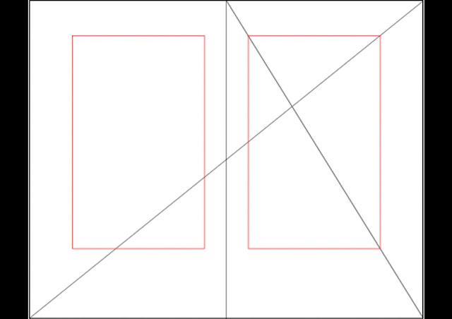 |
| Example of grid on A3 double page spread (Black is remaining space) |
The only problem we had was that the Golden Canon didn't fit to the size of a regular A4 page so we had to make adjustments to ensure that the ratio of the space around the text area stayed consistent as stretching the original grid would have resulted in an obscure ratio.
 |
| New Adjusted Grid |
First lot of sketches

Thumbnail Sketches


 |
| Quick Digital Visualisation |
We started to get together the content for the publication, mainly the images which we sourced from each of the products individual websites, choosing only the highest quality ones. As for the typefaces we chose, we picked DIN as a temporary typeface until we find one that we're happy with how it fits with the content of the magazine.

This layout was slightly different to the previous one as it was more in depth about the bigger, up and coming products hence the inclusion of pros, cons and ratings of each product that wasn't included within the smaller individual, handy tech section.
The plan we had for dividing up the publication was to have 2/3 sections separating the different kinds of tech, such as cheap tech, handy tech and up and coming/futuristic tech. Each of the divider pages would be a unique thing in itself with it's own wording and images to accompany it, hence 'cheap as chips' for the cheap tech section.


The next idea we had was to go for a much more bright and high contrasting style in the hope to make each section different and stand out, again furthering this idea of being different to the usual tech magazine.
 |
| Piece of inspiration |

With this next concept, we used the grid but only to a certain extent, pushing some of the content past the grid to give it more of a less structured feel hence the drawing below.


We weren't entirely sure of the colours so we mocked up a few different contrasting ones.
The last and final concept we didn't at all use a grid, to contrast with other ideas and also the rest of the publication, we thought we would try something different, using illustrations as opposed to photographs.


No comments:
Post a Comment